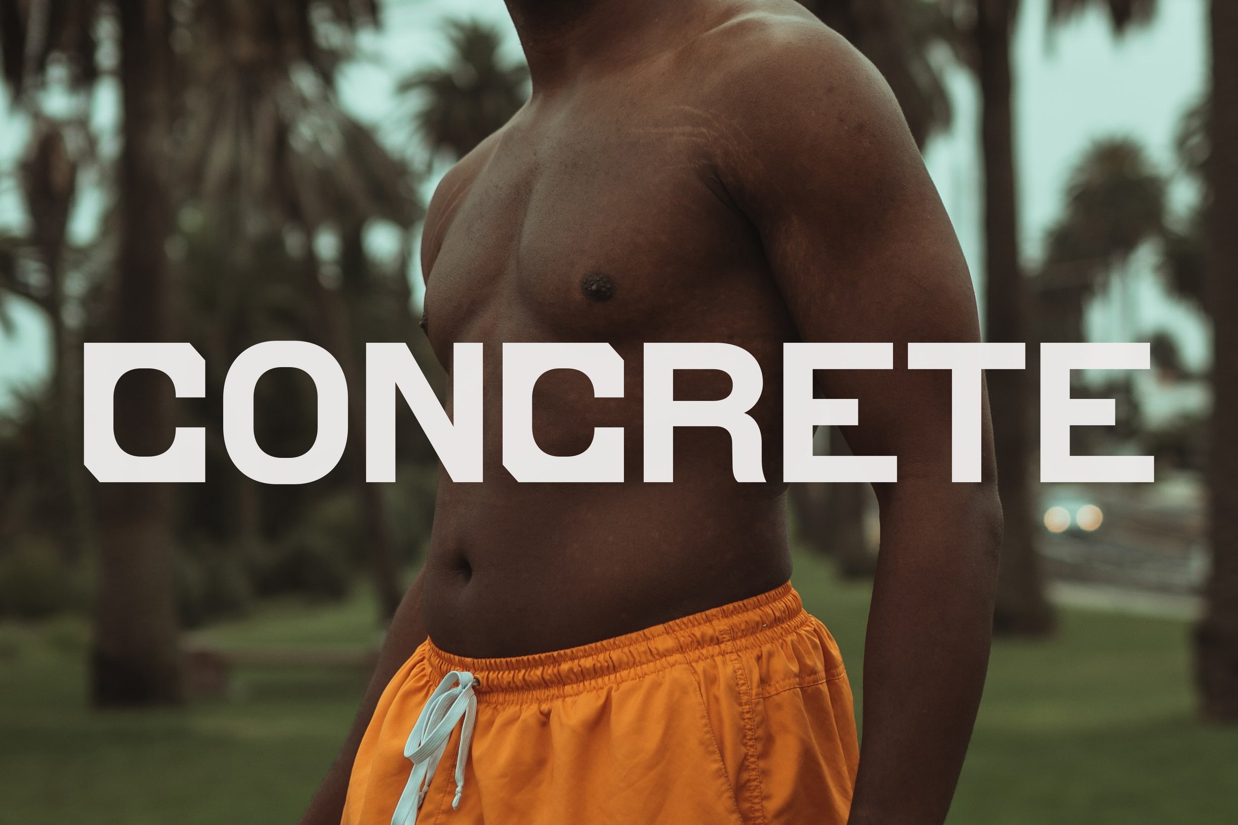
CONCRETE
Concrete is a personal training and team class focussed gym right in heart of Newcastle. Based on the principles of strength and conditioning, Concrete’s programming is designed to build strong, fit humans that move and feel good. Founders Tom Synnott and Sabina Corona, along with their business partner Scott Barrie, are experienced in their fields both as personal trainers and gym goers and have been involved with various gyms around the area for many years. Founding Concrete has long been a goal of theirs, driven by the desire to create an inclusive group-based training system that any individual can benefit from.


They engaged me for the brand identity, brand tone of voice, signage, way-finding, uniforms, and merch early in 2021. The timing of this work ran alongside the planning, architectural design and build of the gym itself. Since then the site that Concrete sits on has turned from an empty warehouse to a bustling fitness hub.
We kicked things off with a workshop to ensure we would whip ourselves into shape (mentally, not physically) when it came to solidifying what Concrete needed to be as a brand. Although at the time there were a lot of things in the air, many plans still to be made, and a number of logistics still to be ironed out. The vision for the brand and what was driving it was clear.
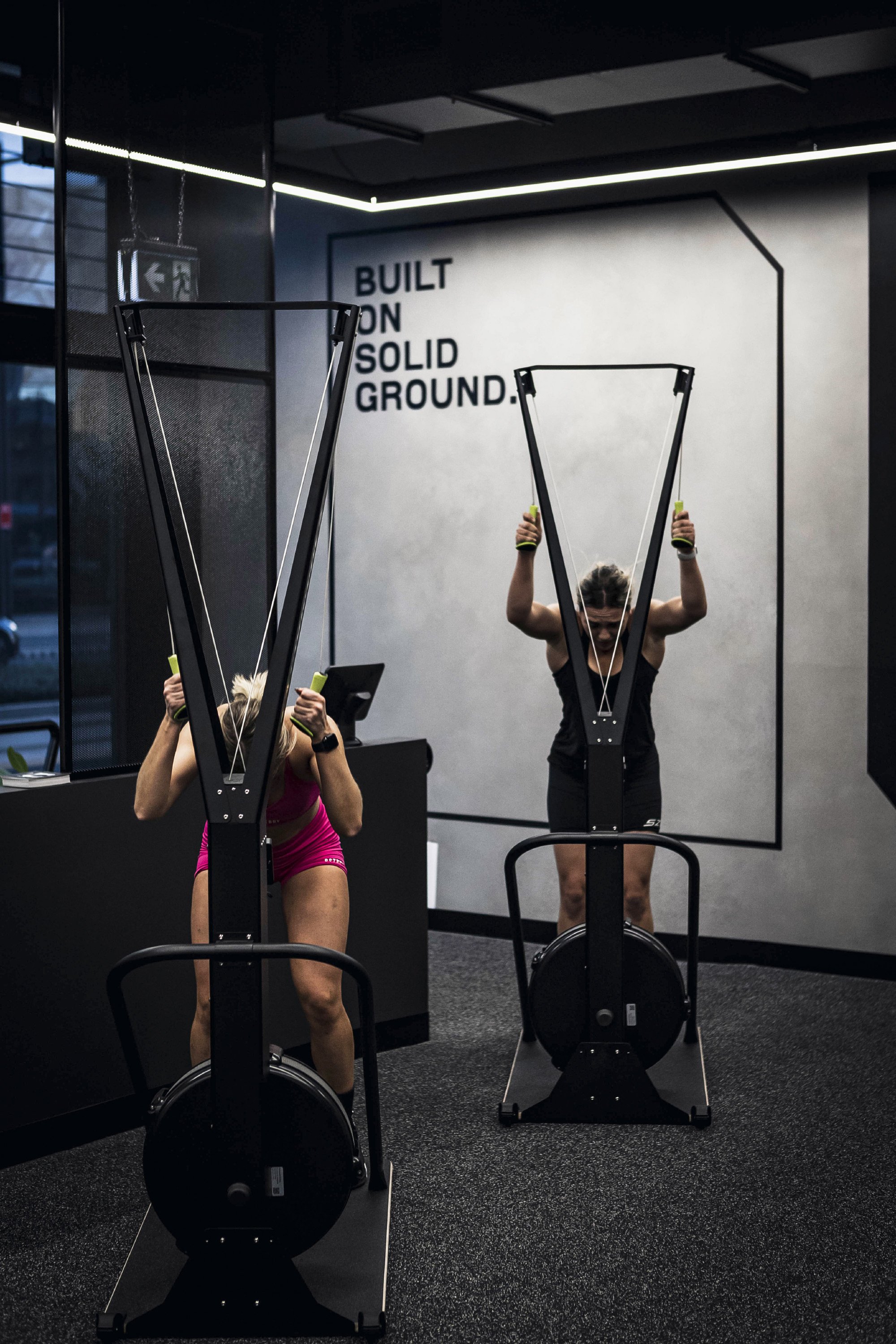
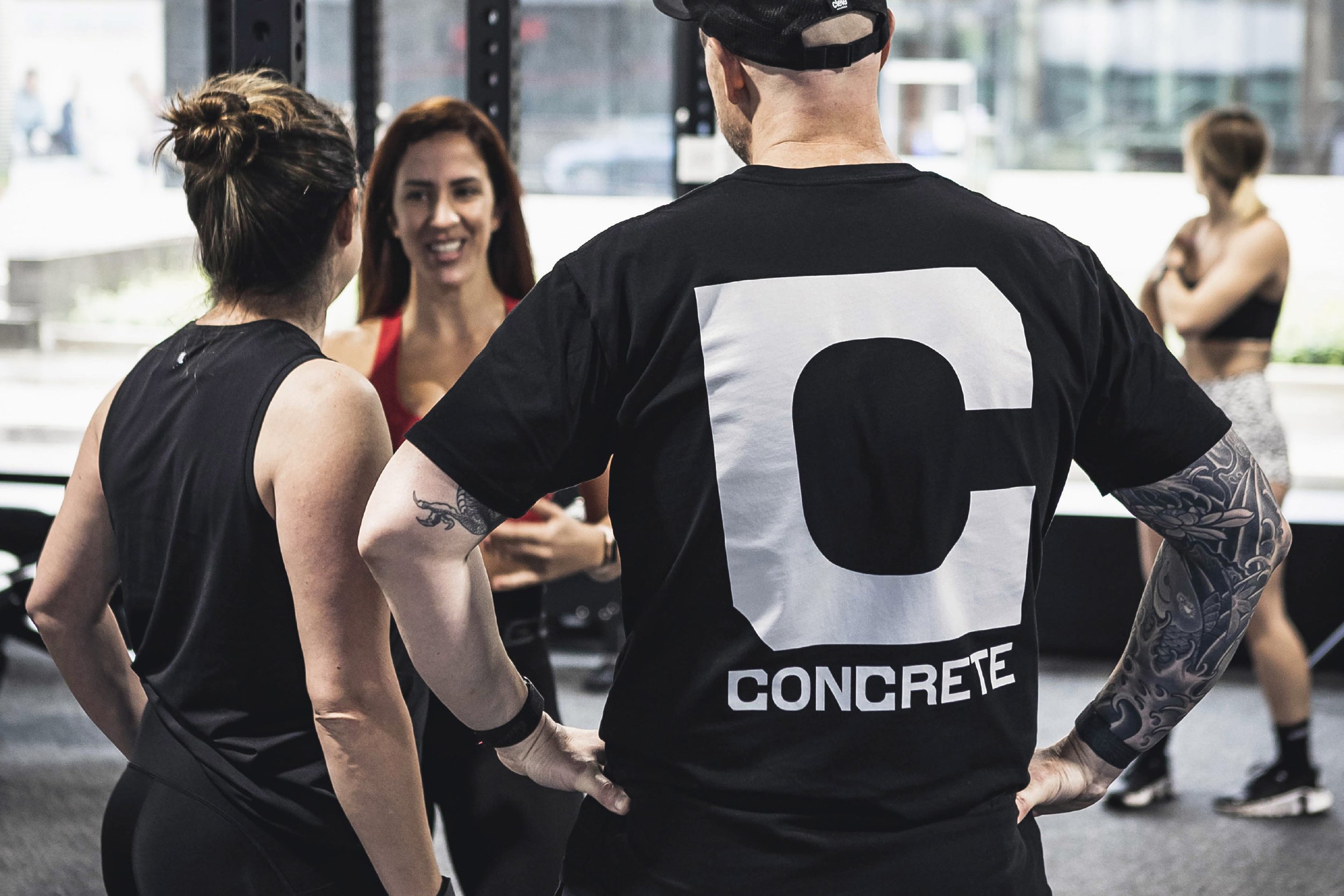
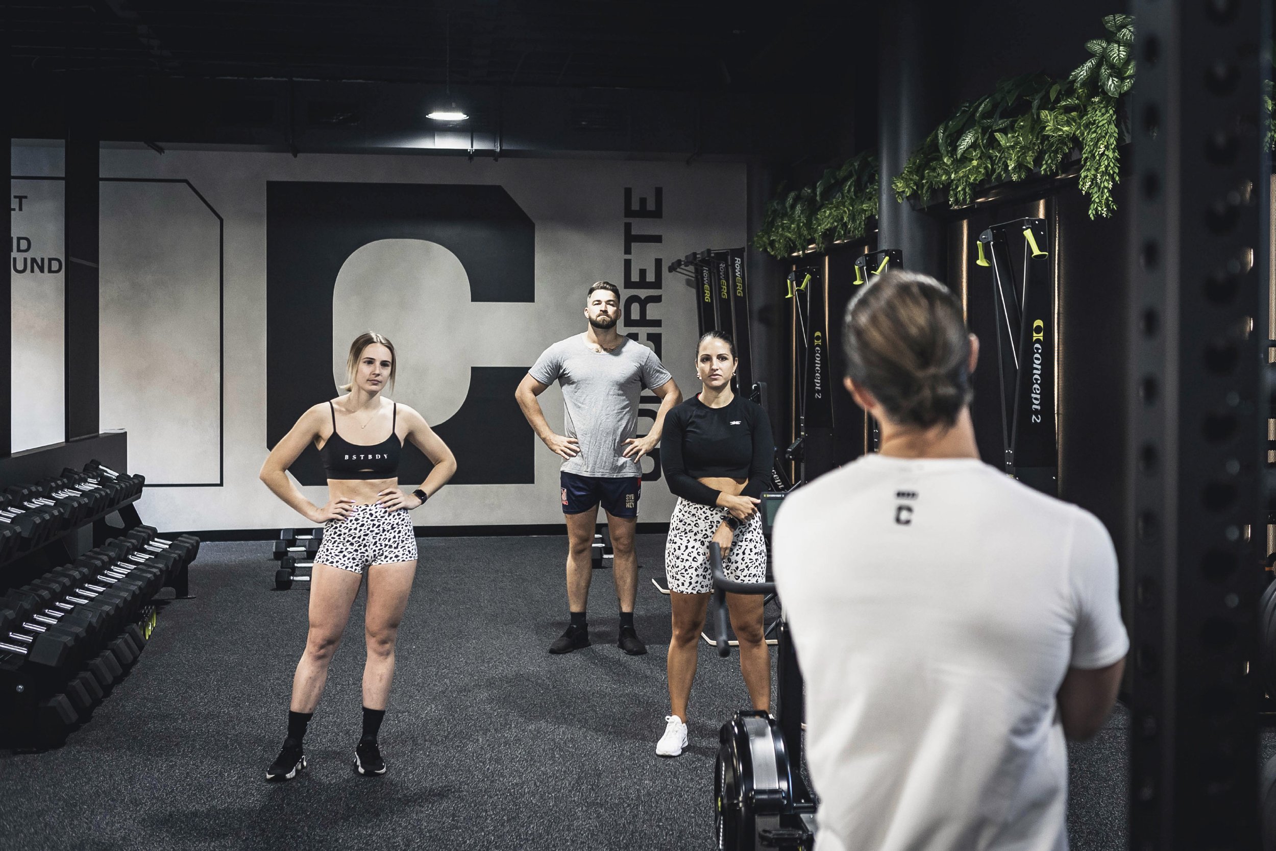
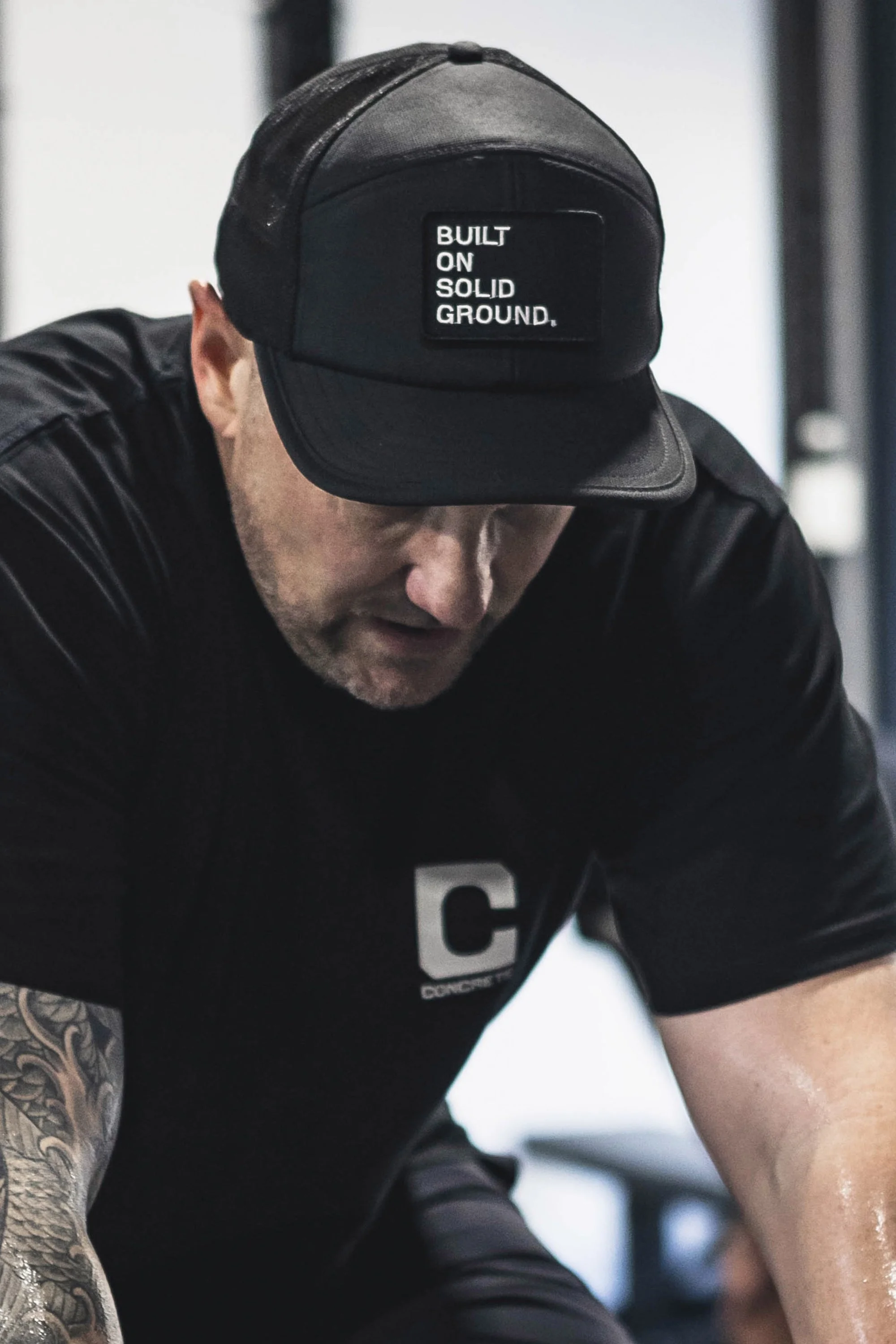
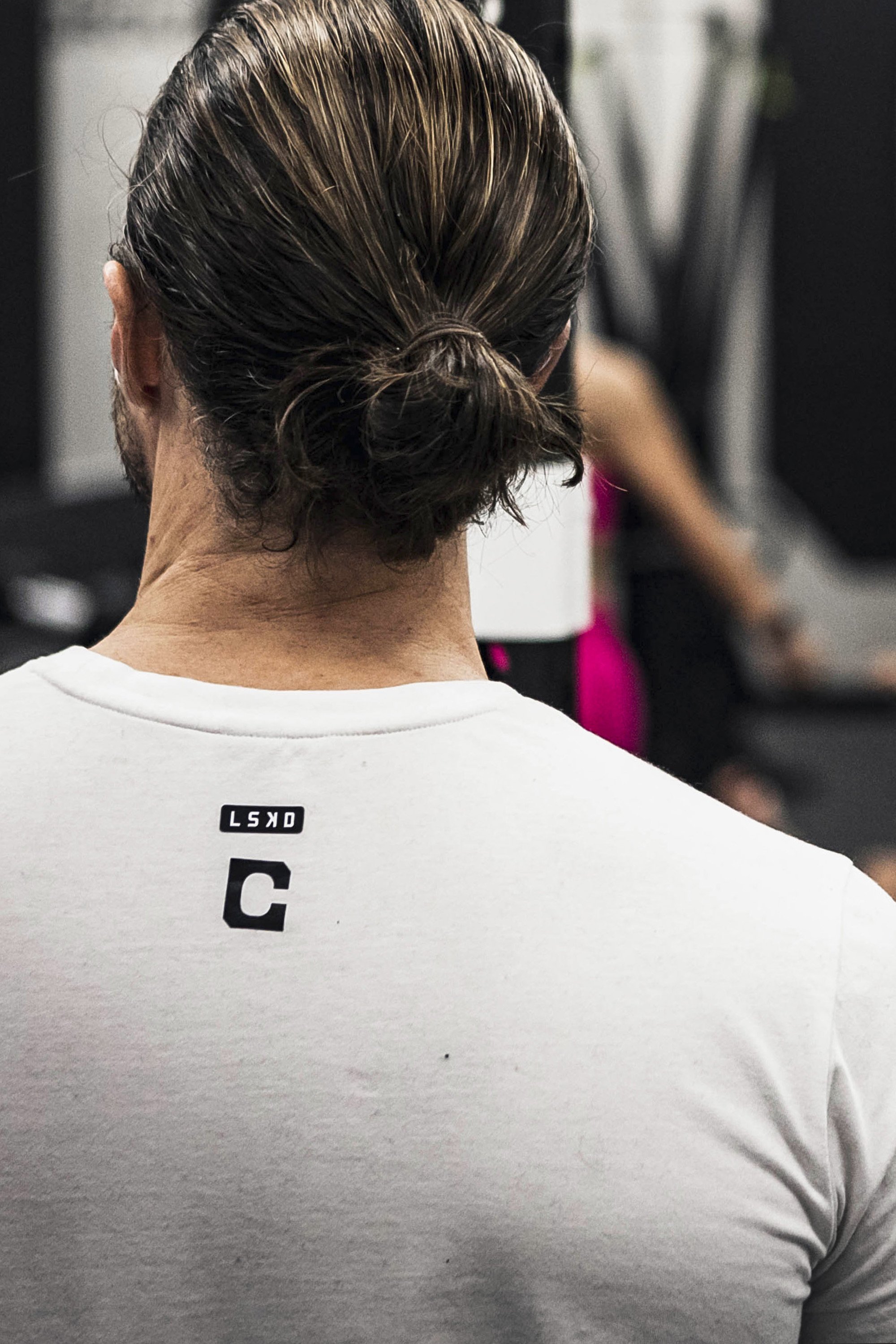
It was identified that the Concrete brand identity and every touch-point, from the physical space to the people who work there and the people who work out there, should always carry with them in equal parts strength and kindness. The gym was not only going to be for elite athletes, but also for the everyday athlete. There will be support always available, alongside a challenging push when it’s needed. Uniforms and merch will be worn with pride and in years to come, the community built in and around Concrete will be one people will look to for guidance when it comes to anything fitness.
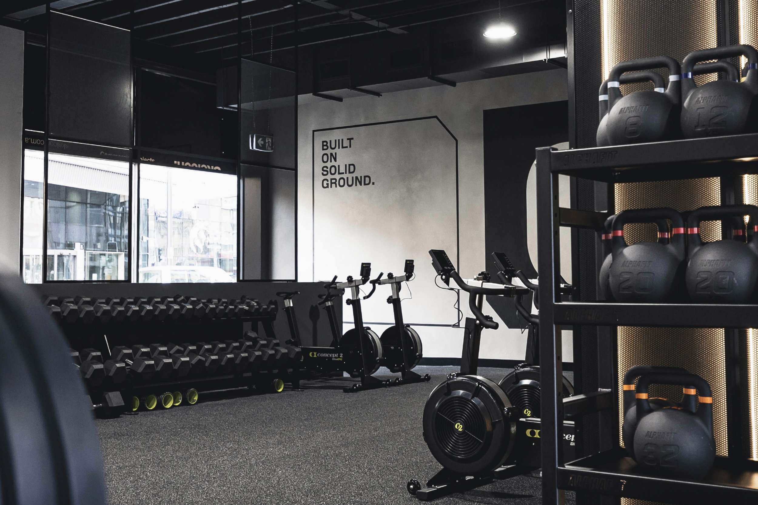
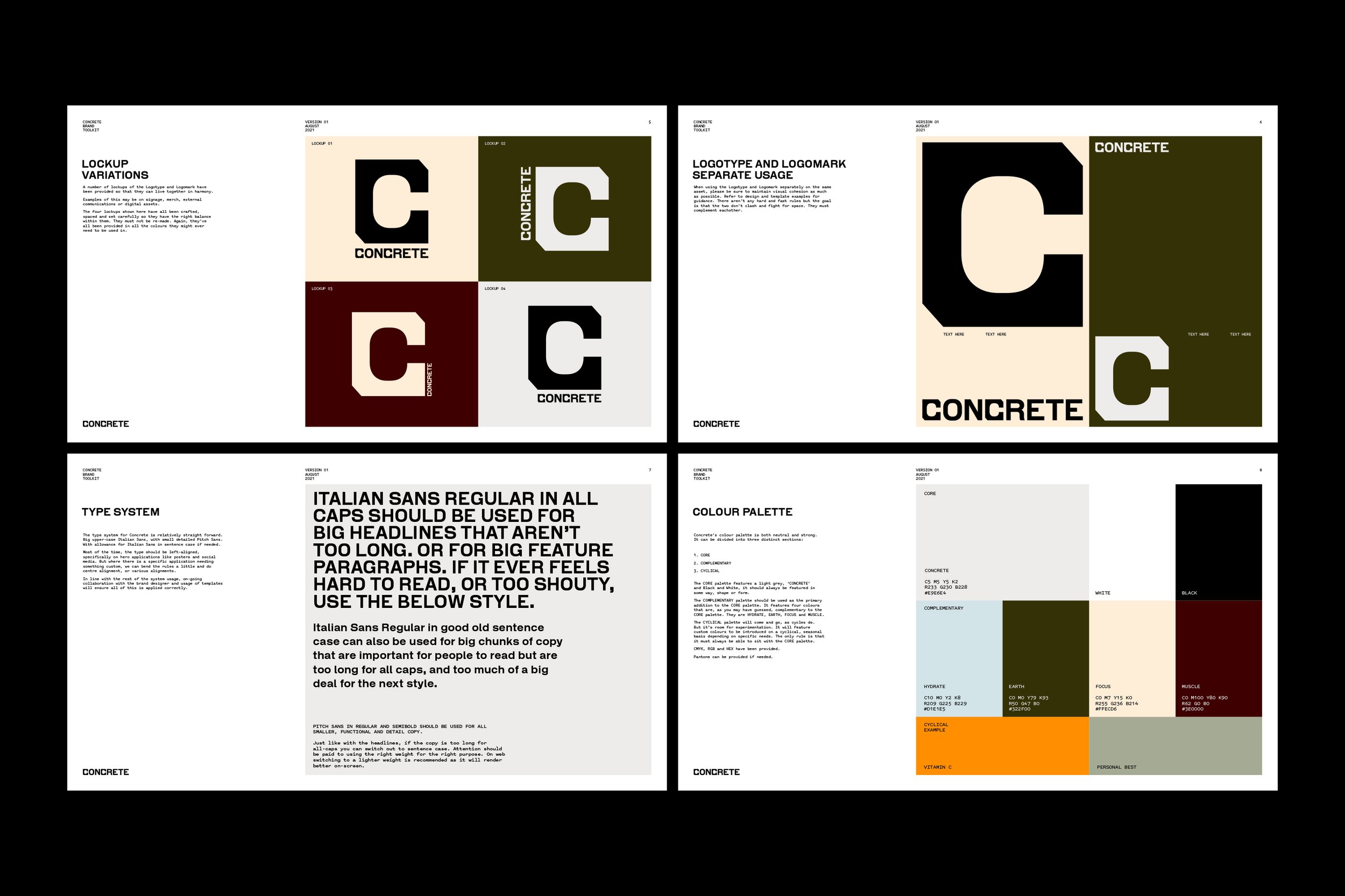
The stand-out elements necessary for a successful outcome in a brand identity were identified as being a symbol logomark as part of the system, a colour palette that is predominantly black and white and a tone of voice that promotes accessibility, not exclusivity.
Another key takeaway from the workshop was that there were a number of seemingly opposing values needing to be balanced throughout the brand identity, brand tone of voice and in the approach to running Concrete in general. Tom, Sabina and Scott wanted Concrete to build an environment that was hard, yet soft. Challenging, but supportive. That encouraged a sense of community, as well as leadership.


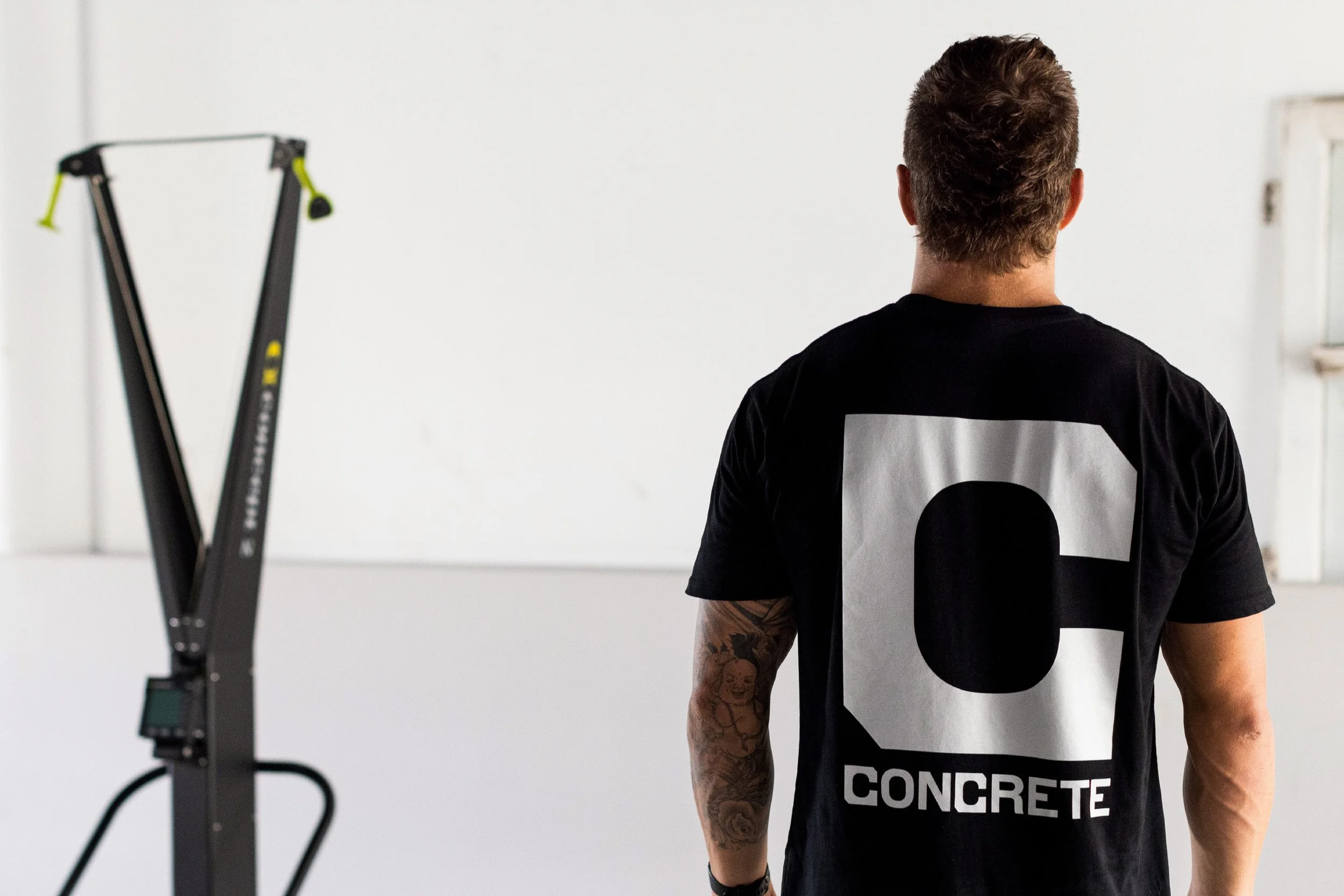

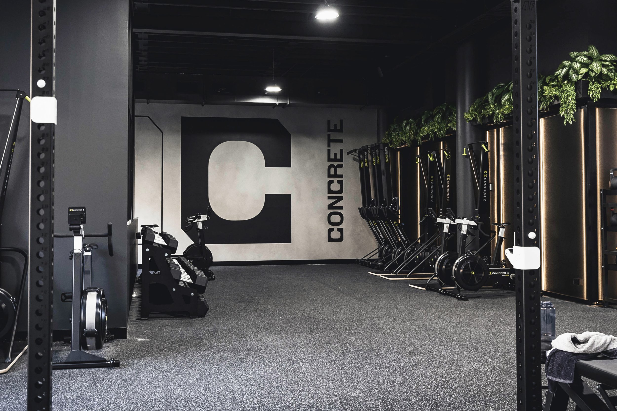
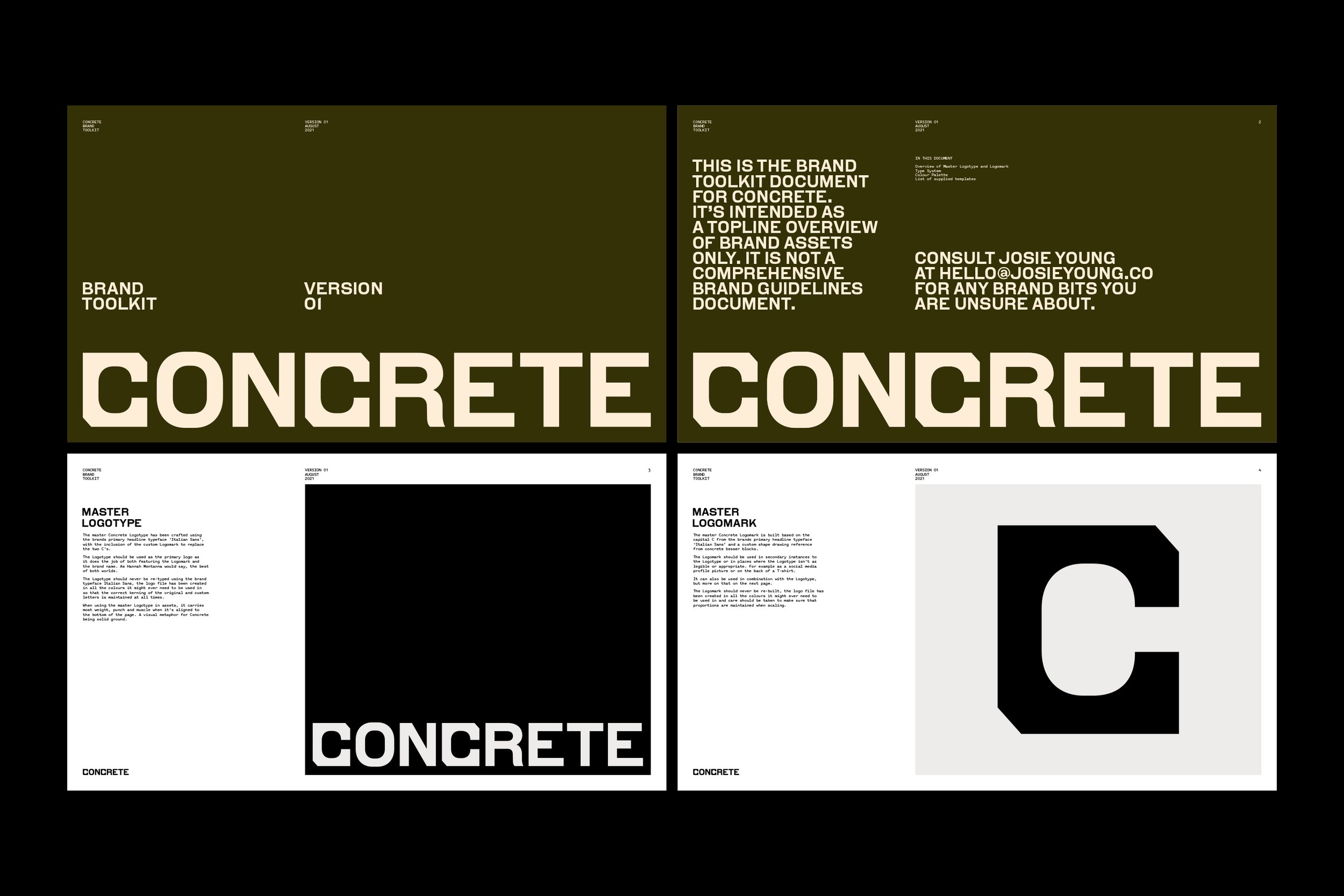
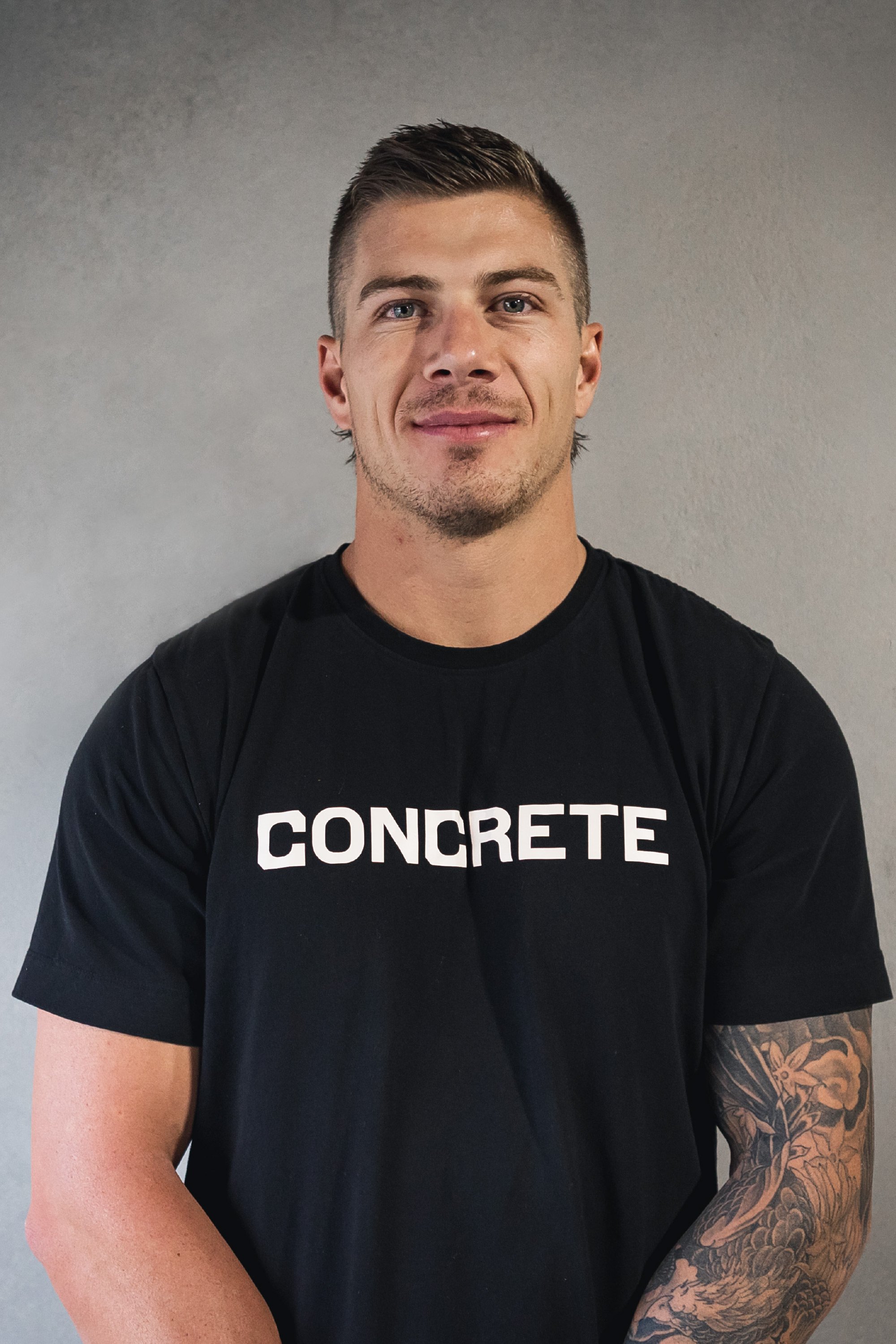
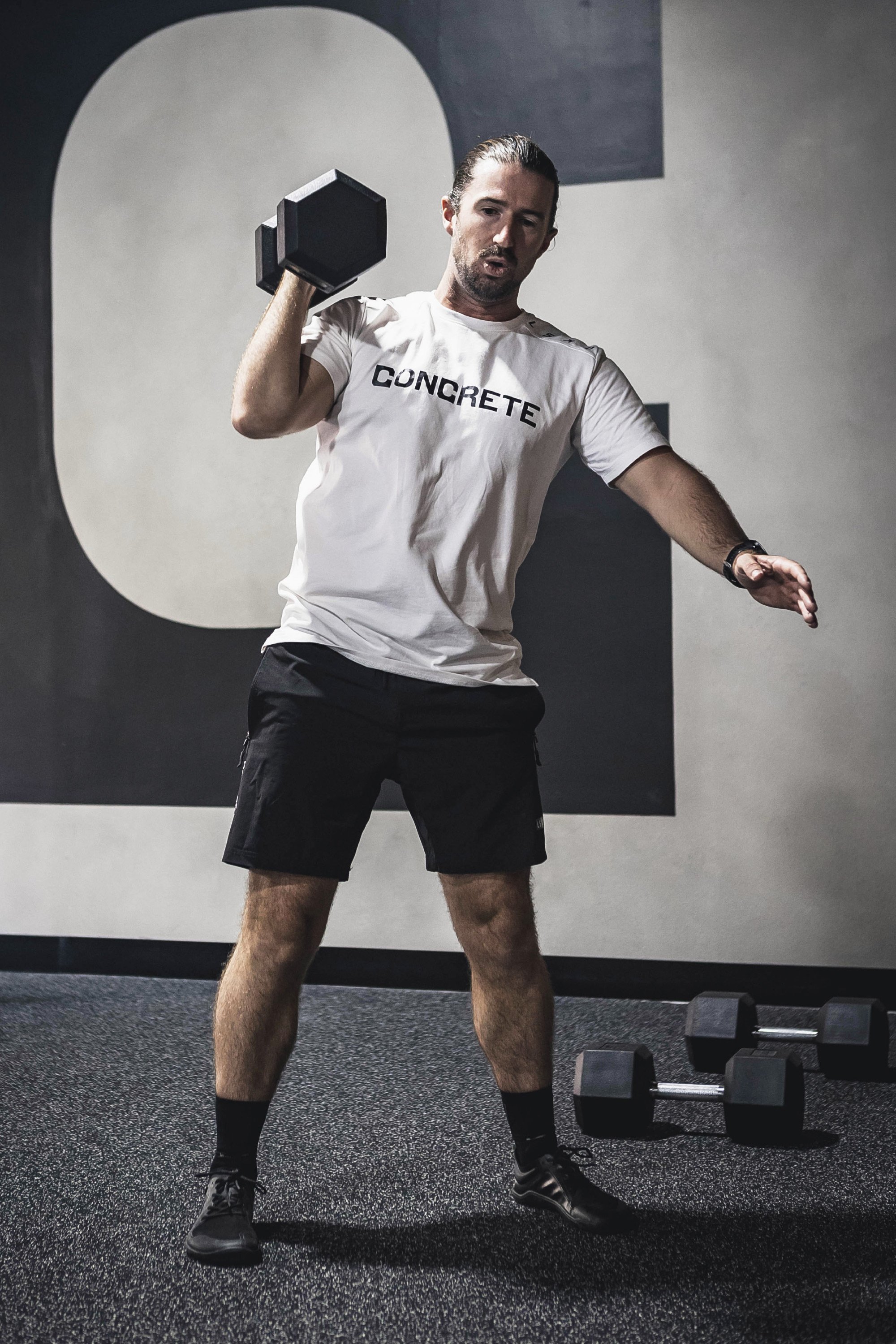
The resulting identity is a custom C monogram that also forms the base for the primary logotype. Using Italian Sans by A2-Type as the base, the C has been modified, referencing concrete besser blocks. The combination of this custom C mark and the standard letterforms in Italian Sans are bold, they balance the hard and the soft and form a foundation of strength for the rest of the brand system to follow.
The punch in the custom monogram, logotype and the use of Italian Sans as the big, strong headline typeface is then paired with the swift kick of Pitch Sans by Klim Type Foundry for body and lower-level copy (I’m trying to make workout gags, is it working out?). A practical, functional pairing that allows for ease of communication throughout various pieces of collateral and communication materials. When main brand pieces and the use of the headline type need to be large and in charge, necessary details remain legible.
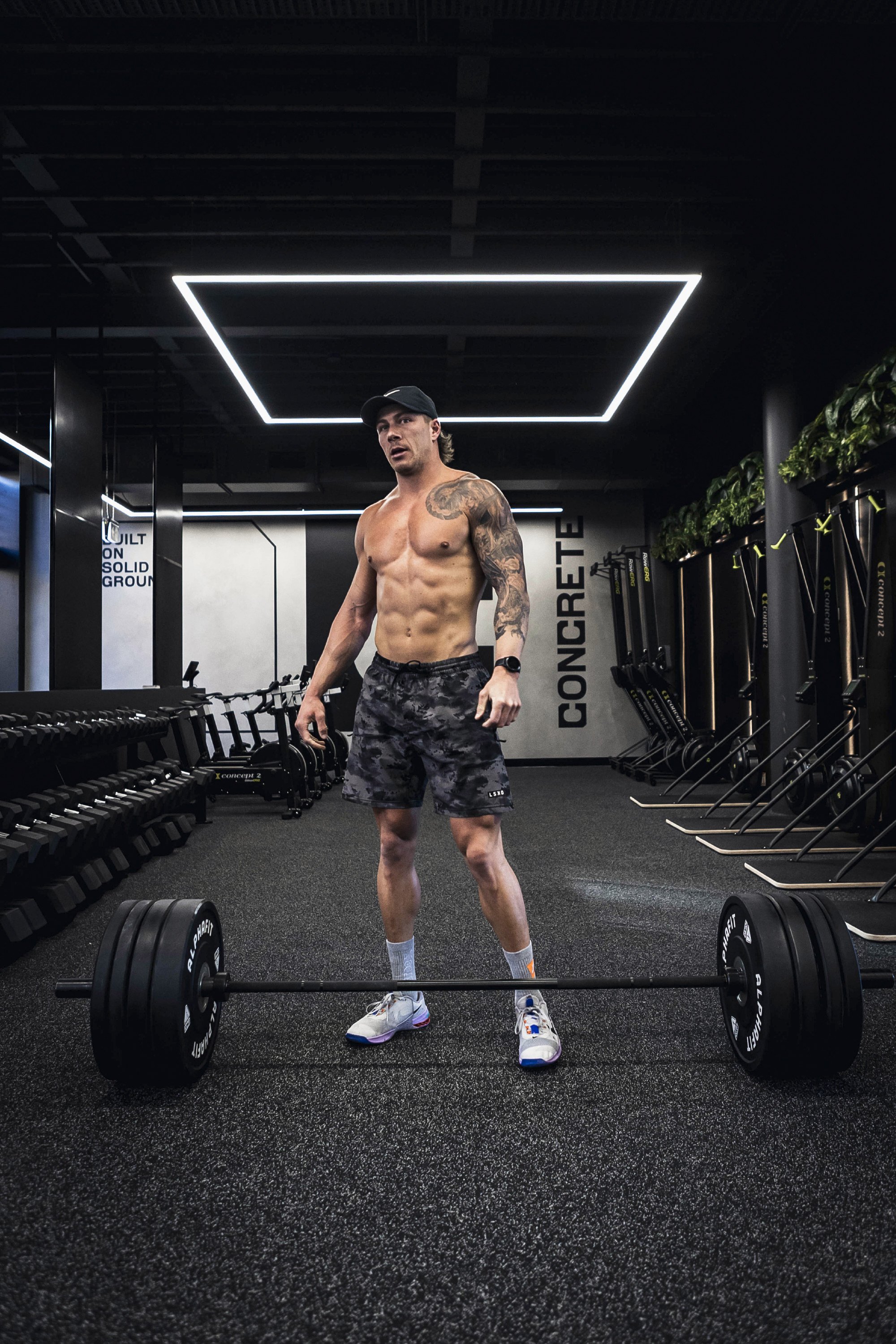
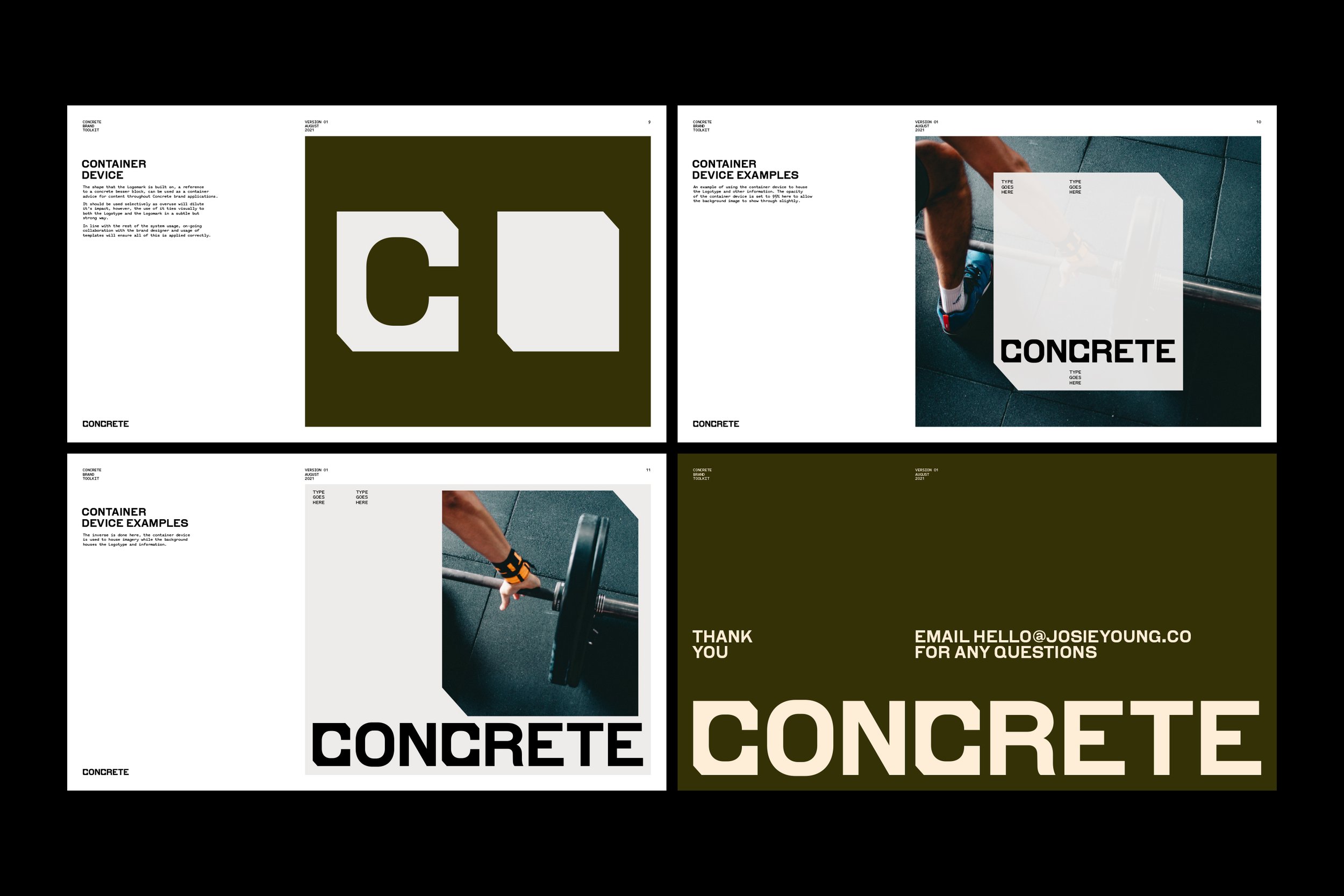
The C monogram then forms the foundation for a container device that can be used through collateral to house content, imagery, and information and otherwise be used as a feature graphic device.
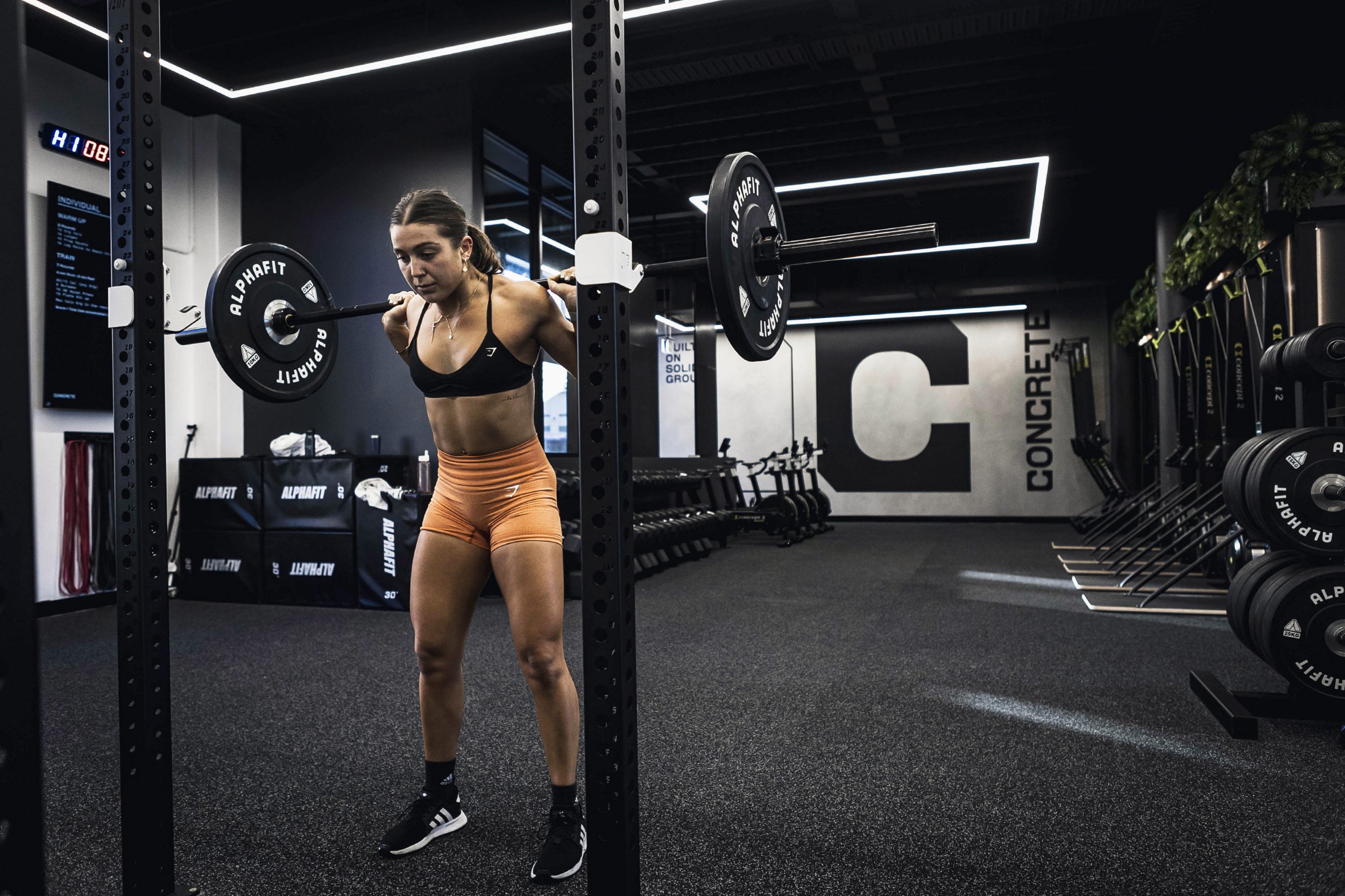
As identified as a requirement early on, the colour palette is largely black and white. Pops of neutrals and a hot orange have been added in to allow for some flexibility. But also because it’s fun, it taps into the balance of opposing values and allows for a bit of a different personality to shine through when the mood strikes.
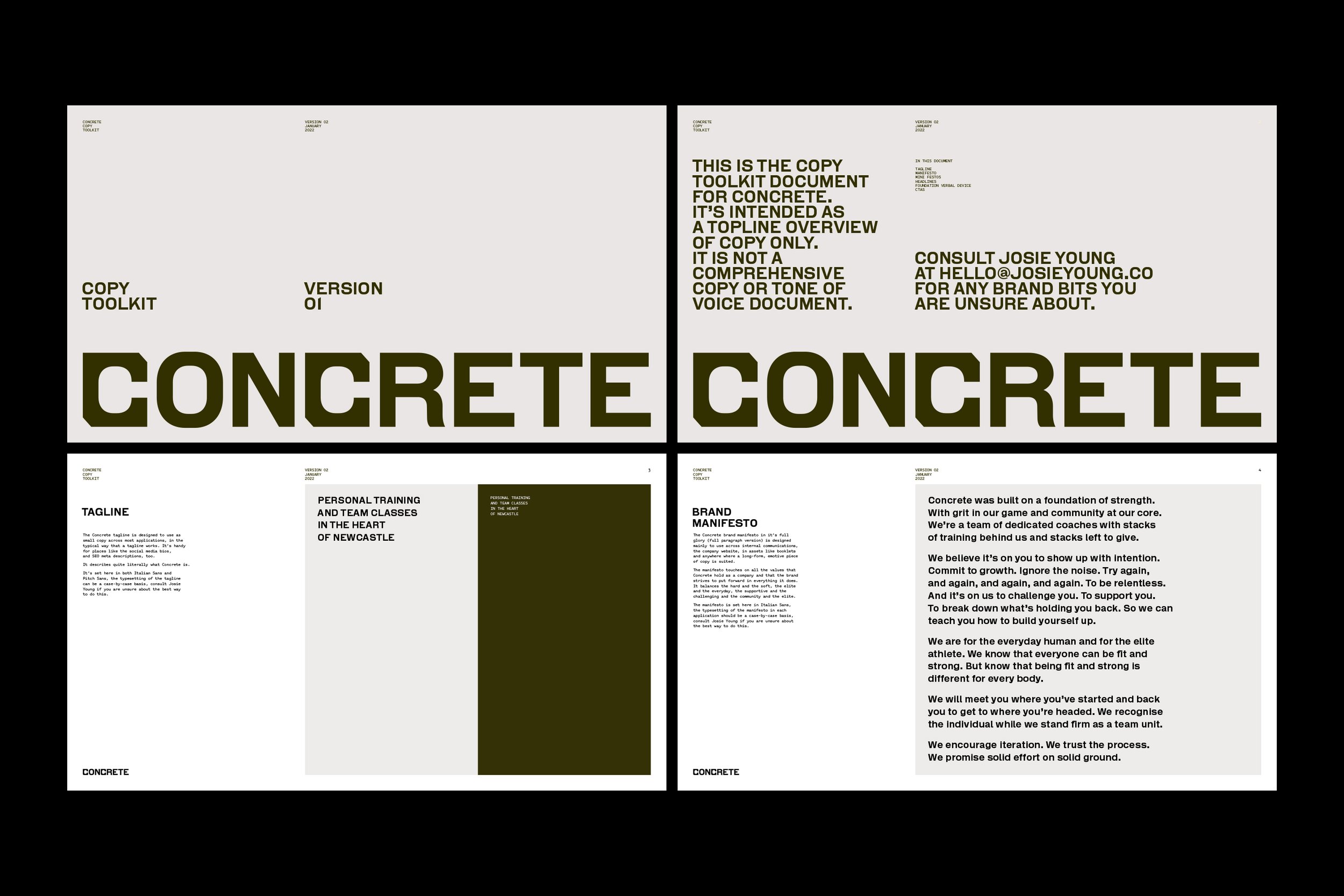
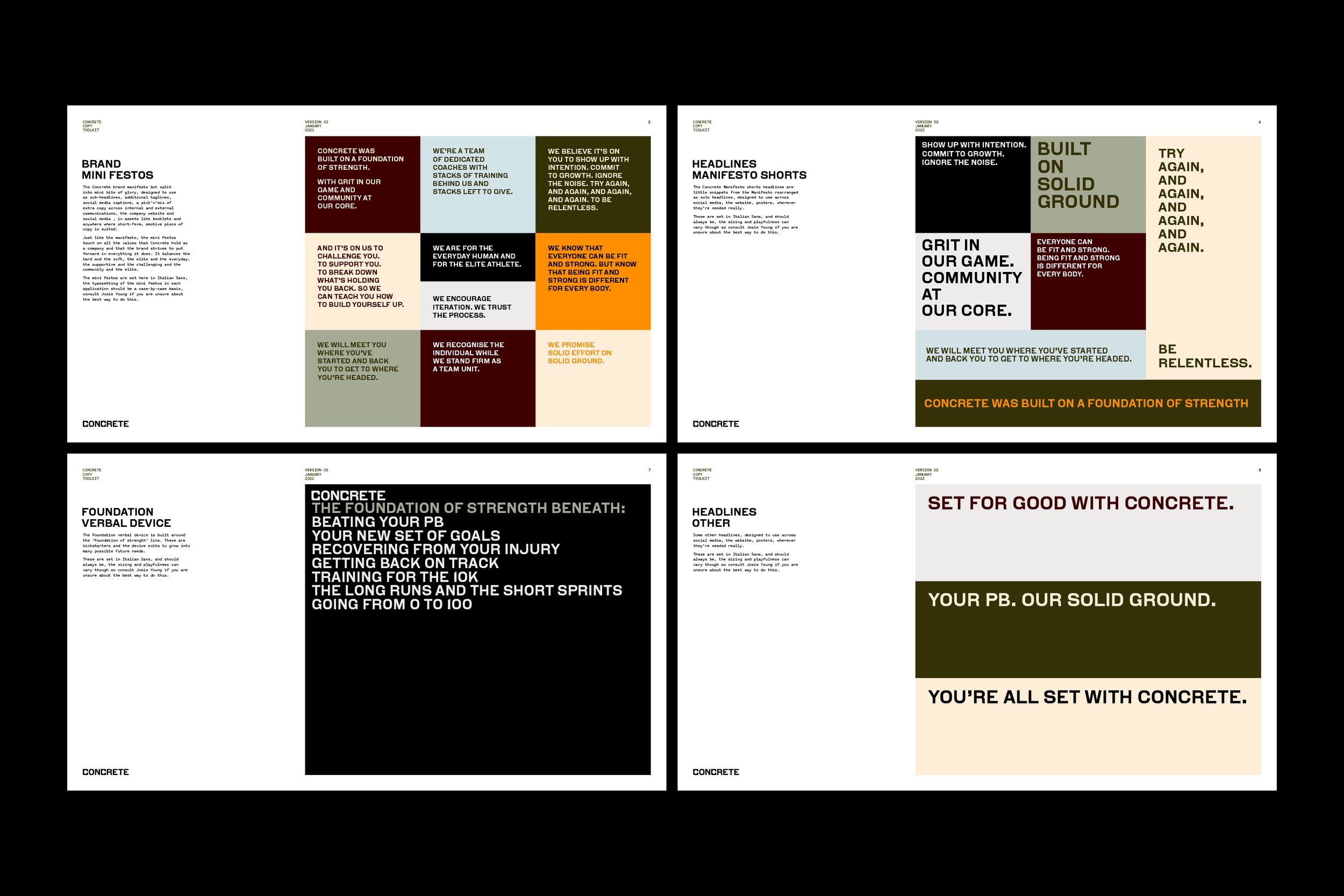
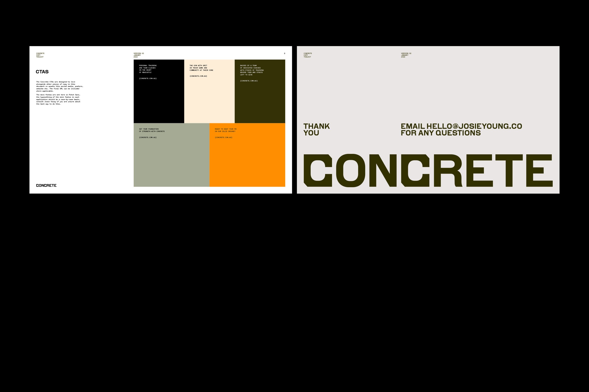
For the brand tone of voice, a number of pieces of copy for both internal and external purposes have been developed. The brand manifesto taps into both the values held by the founders and the values they want to instil in their members. This is then followed by a series of mini-festos they can use more externally and more regularly throughout spacial, social and marketing communications.
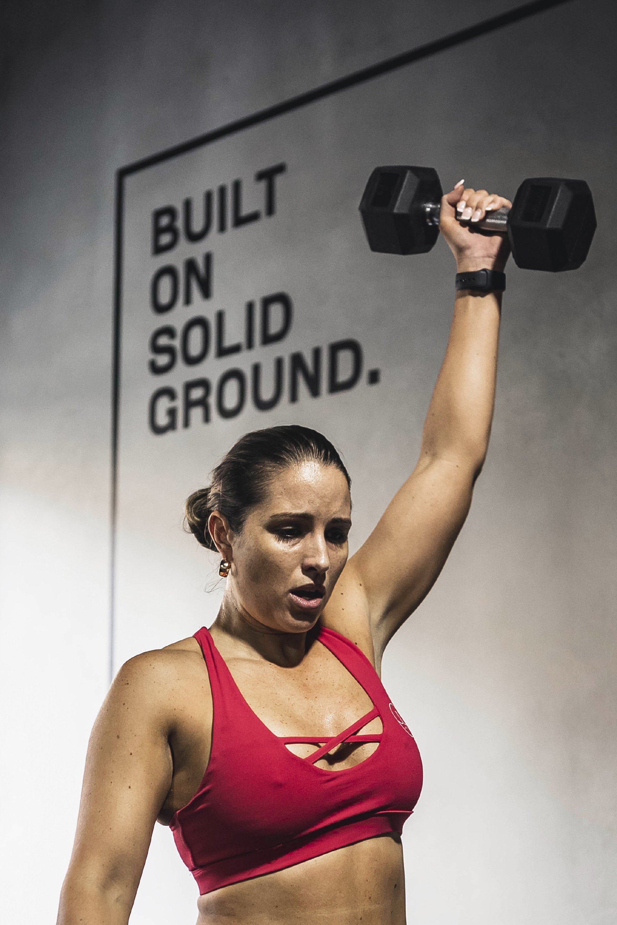
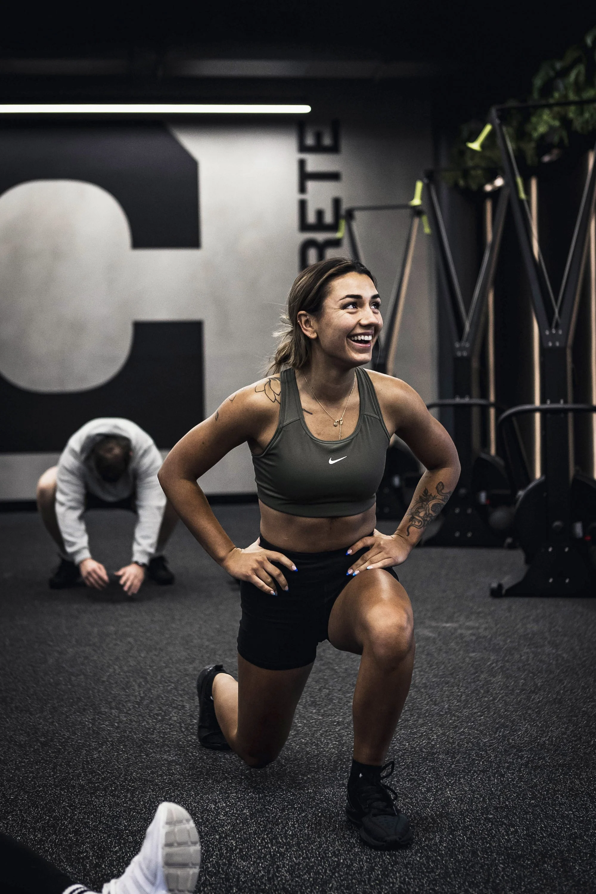
While the gym was under construction, a virtual walk-through of the architectural render of the gym was undertaken. The purpose of this was to audit the space for all possible touch-points for the brand to come to life in the space, including signage, way-finding, merch, merch displays and murals. Resulting in over 50 completed concepts, designed and delivered. All of which are slowly being rolled out as the gym grows. In the entrance and on the main wall is a two-stage mural that has been conceived to grow and change with the gym.
In the various templates developed for Concrete to use in-house, a number of different hierarchies of information were looked at to allow for maximum flexibility across as many possible future areas of communication. From social media to internal gym workout screens to printed posters. The templates allow for information within the hierarchies to be dialled up or down. Some pieces feature large imagery and less information, and some the opposite with lots of information and less imagery. But all remain functional, legible and on brand.
The website, developed in-house by Concrete founder Tom Synnott (who previously worked in the digital space, handy!), utilises the tools of the brand as outlined in the brand toolkit. The implementation of these tools demonstrates their ease of use, functionality and the success of the brand identity as a whole.
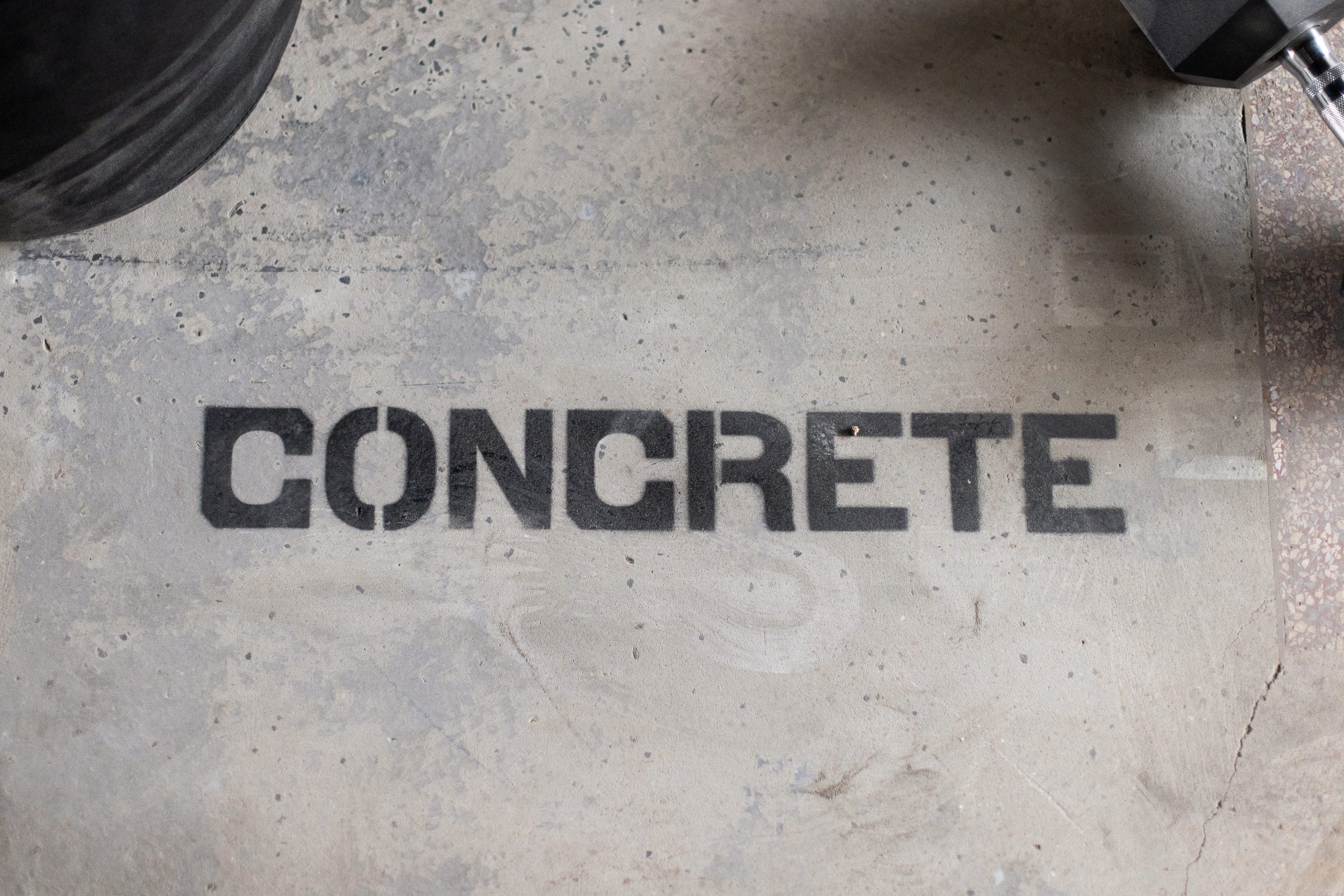
Tom, Sabina and Scott have been running Concrete solidly since they opened their doors in early 2022. They wear their merch with pride and spray their concrete with real stencils.


CREDITS
Brand photography – Iron Monkey Photo
Website – Tom Synnott