AND THEN
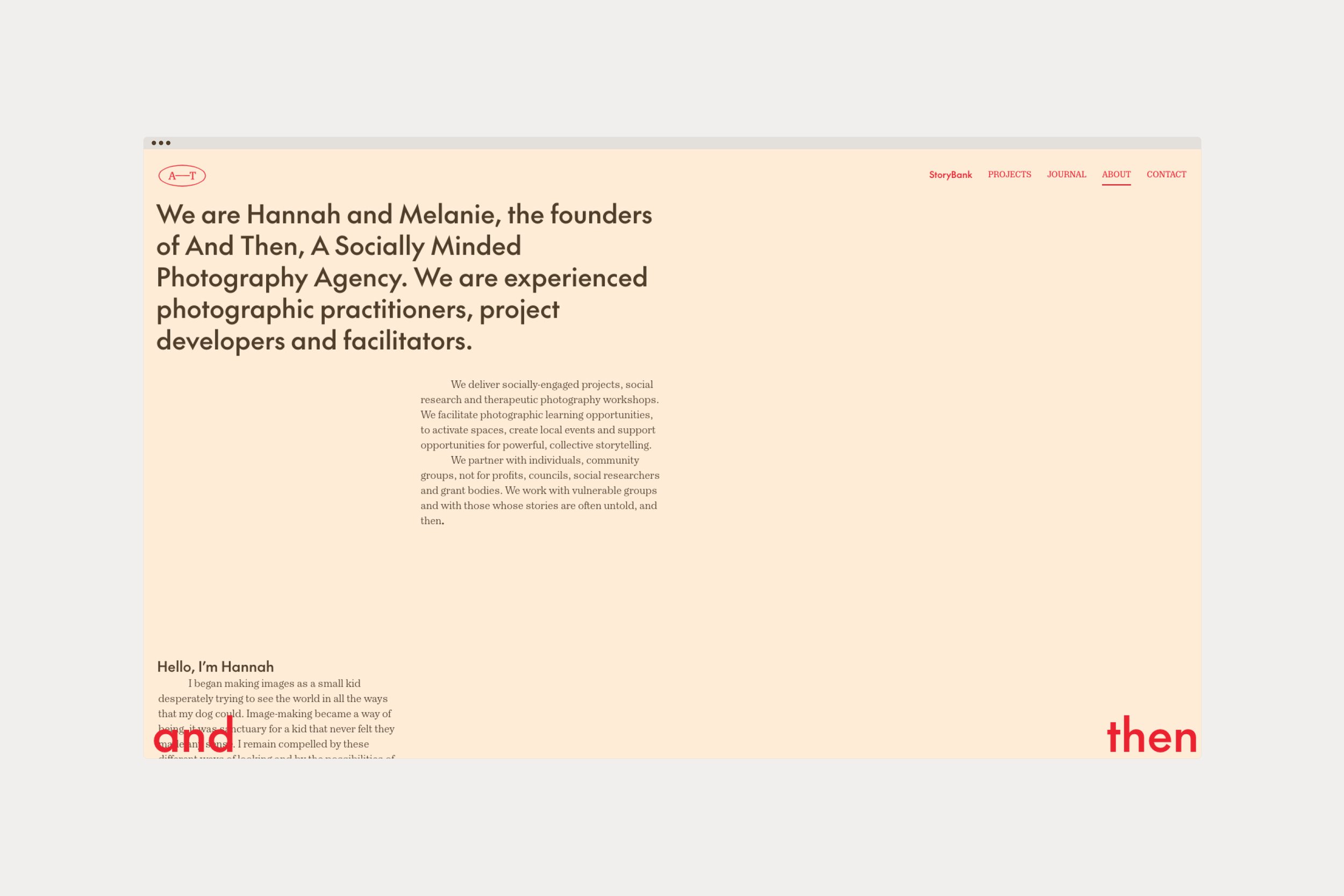
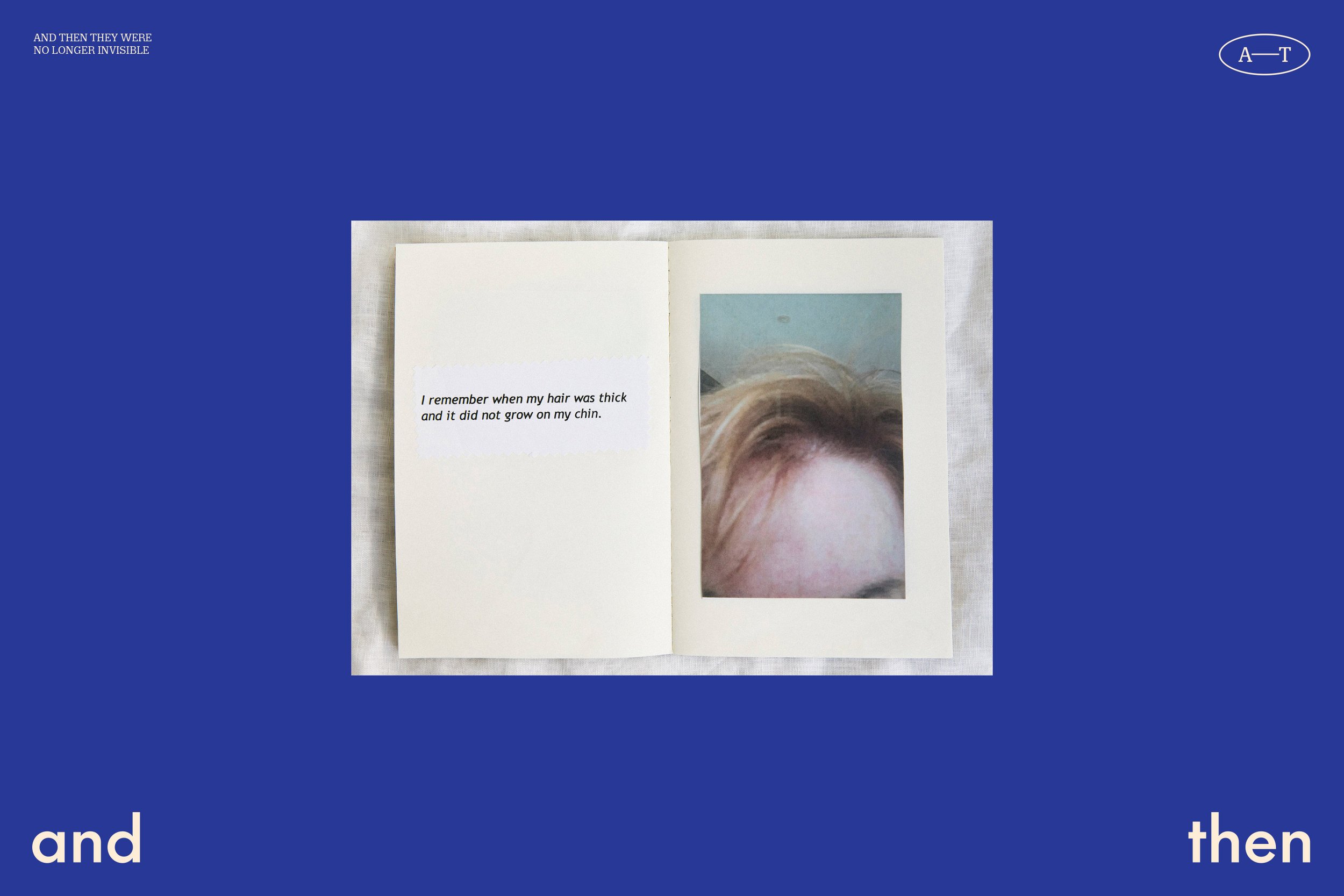
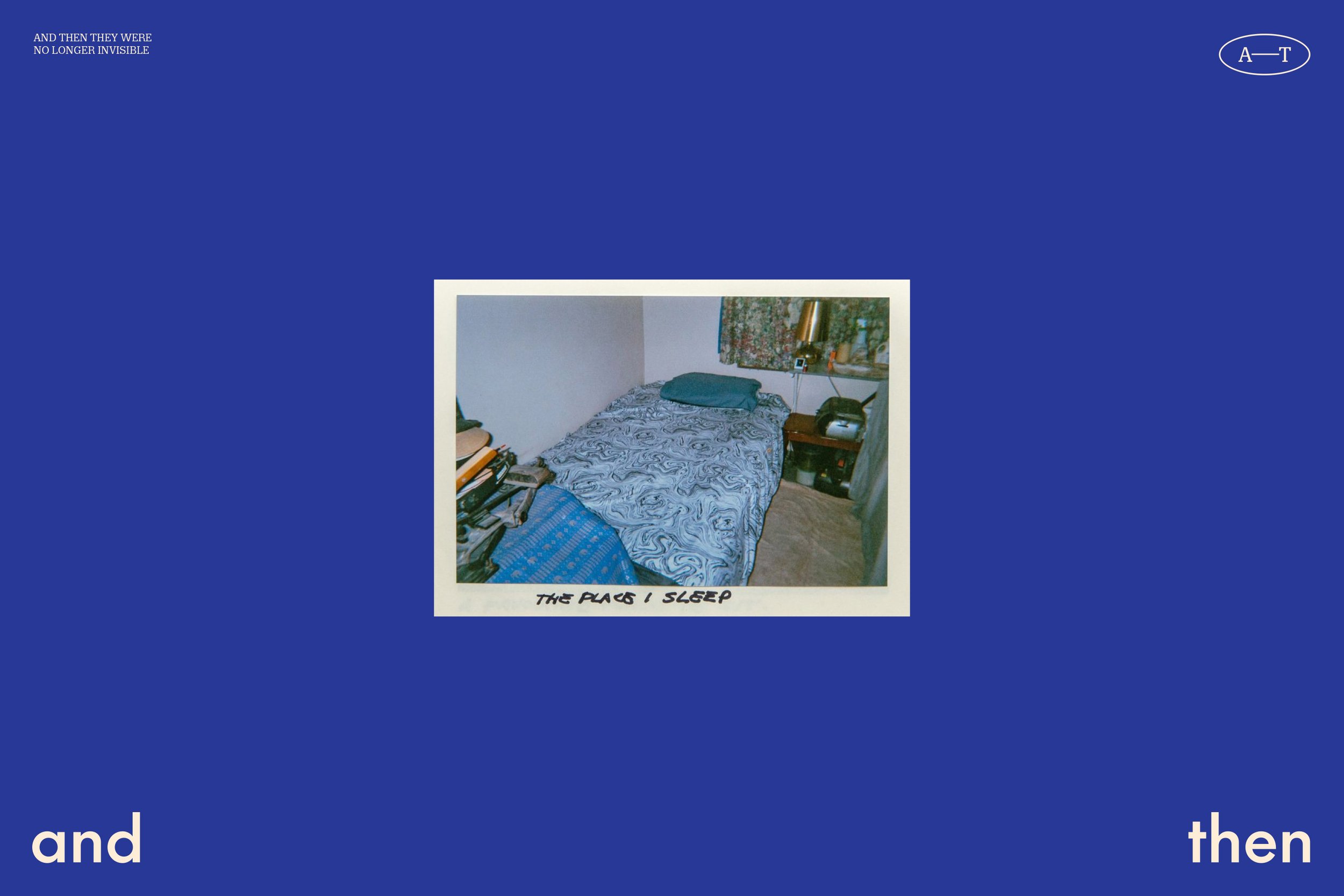
And Then are a Newcastle-based photography agency engaging in photography as a social practice. They invite participation and connection with people to help them tell their own stories by delivering projects, conducting research and running workshops in and around their local communities.

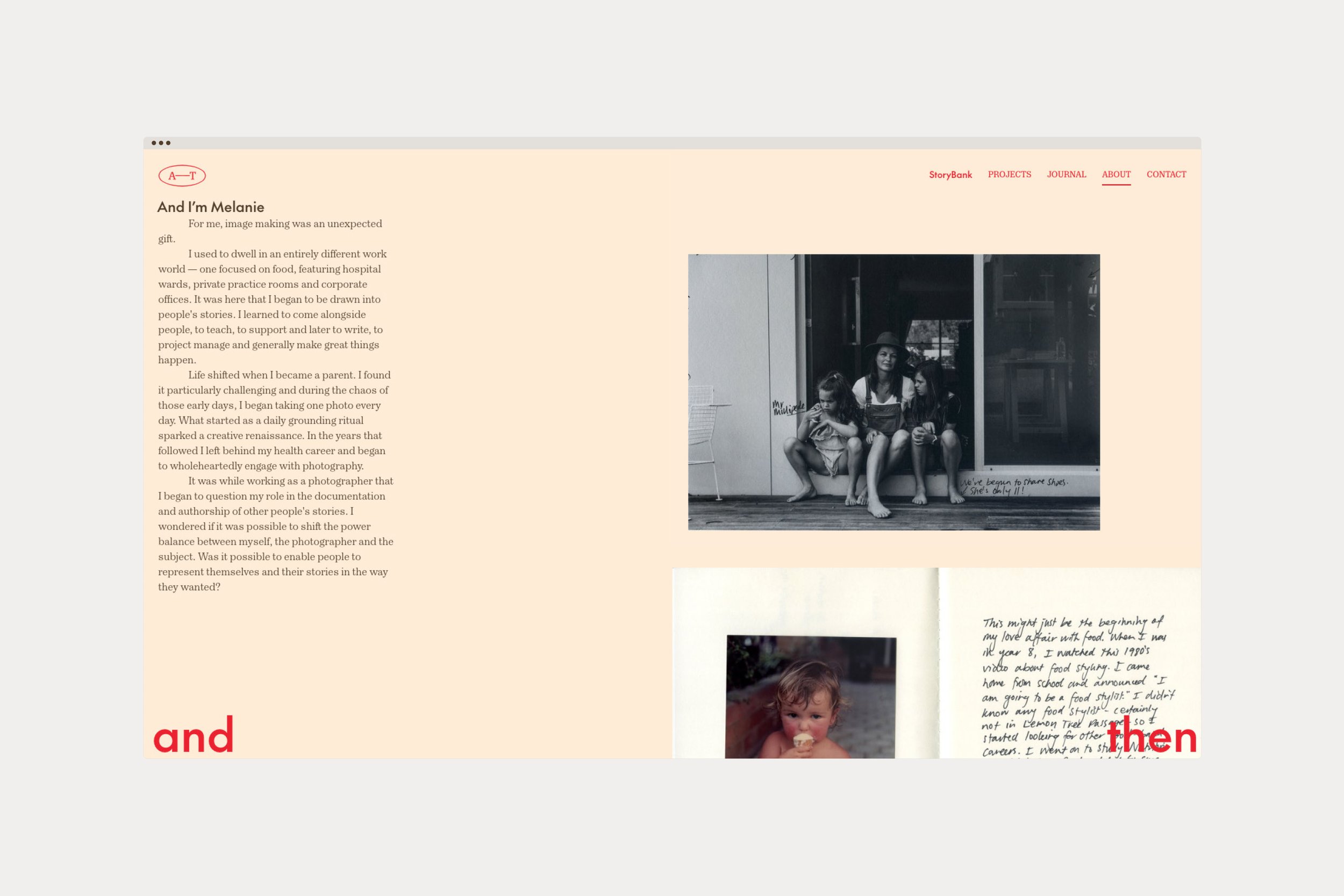
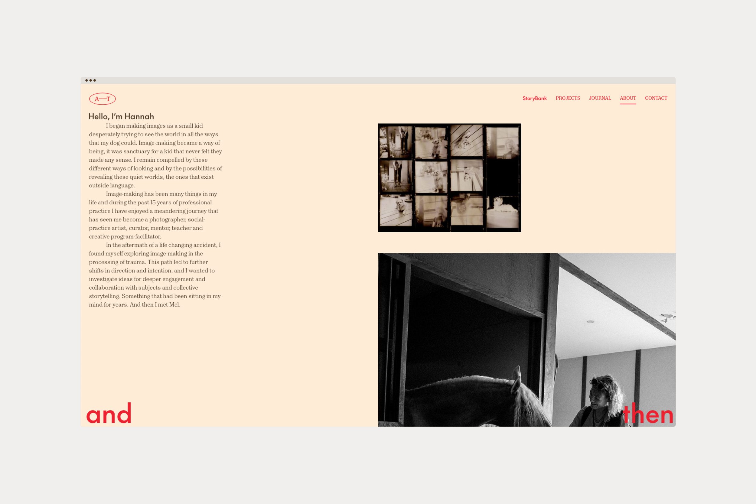
Founders Hannah Robinson and Melanie Muddle are experienced photographic practitioners, project developers and facilitators. They joined forces to form And Then and engaged me for the brand identity, brand tone of voice and digital design.
From the outset, it was important that the visual identity and brand tone of voice would be treated as a unified piece of work. A well considered verbal approach meant that Hannah and Melanie could communicate effectively to everyone they needed to communicate to.
How the words “and then” were used in addition to them being the brand name was paramount. They are already familiar as they come from everyday vernacular, but in a different context. They are two words rarely found at the start of a sentence. The phrase “and then” is an operative piece of language. It’s often used as a connector, to move from one thing to another. It refers to something that may come subsequently, or soon after what came prior. The words “and then” allow for continuation.
The resulting verbal approach was to use it as its originally intended to be used, grammatically, where “and then” functions as both a brand name and a verbal device. Somewhere to head to and somewhere to come from. To inform direction and movement. A point of connection, a point of continuation, and sometimes, a point to be continued…

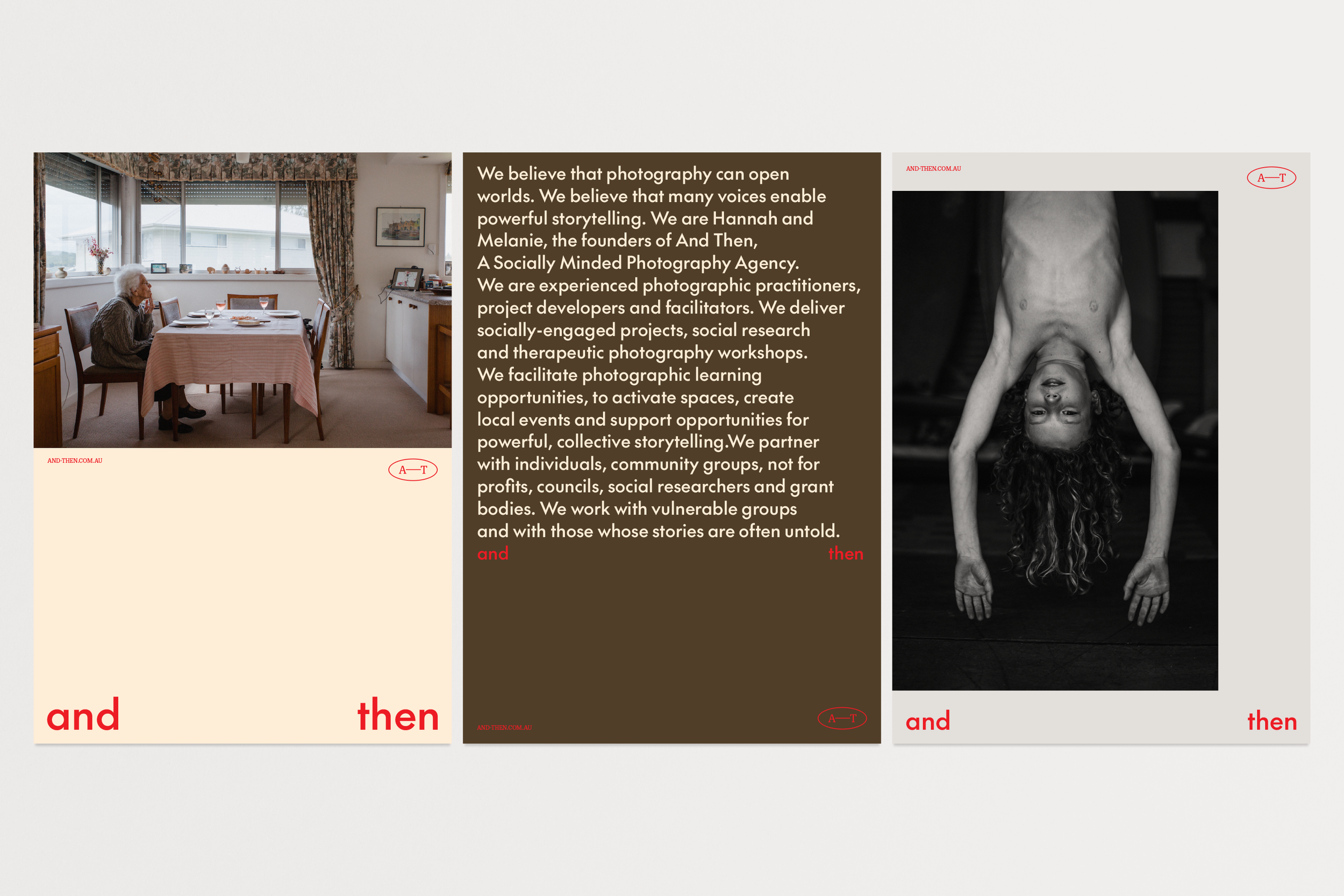

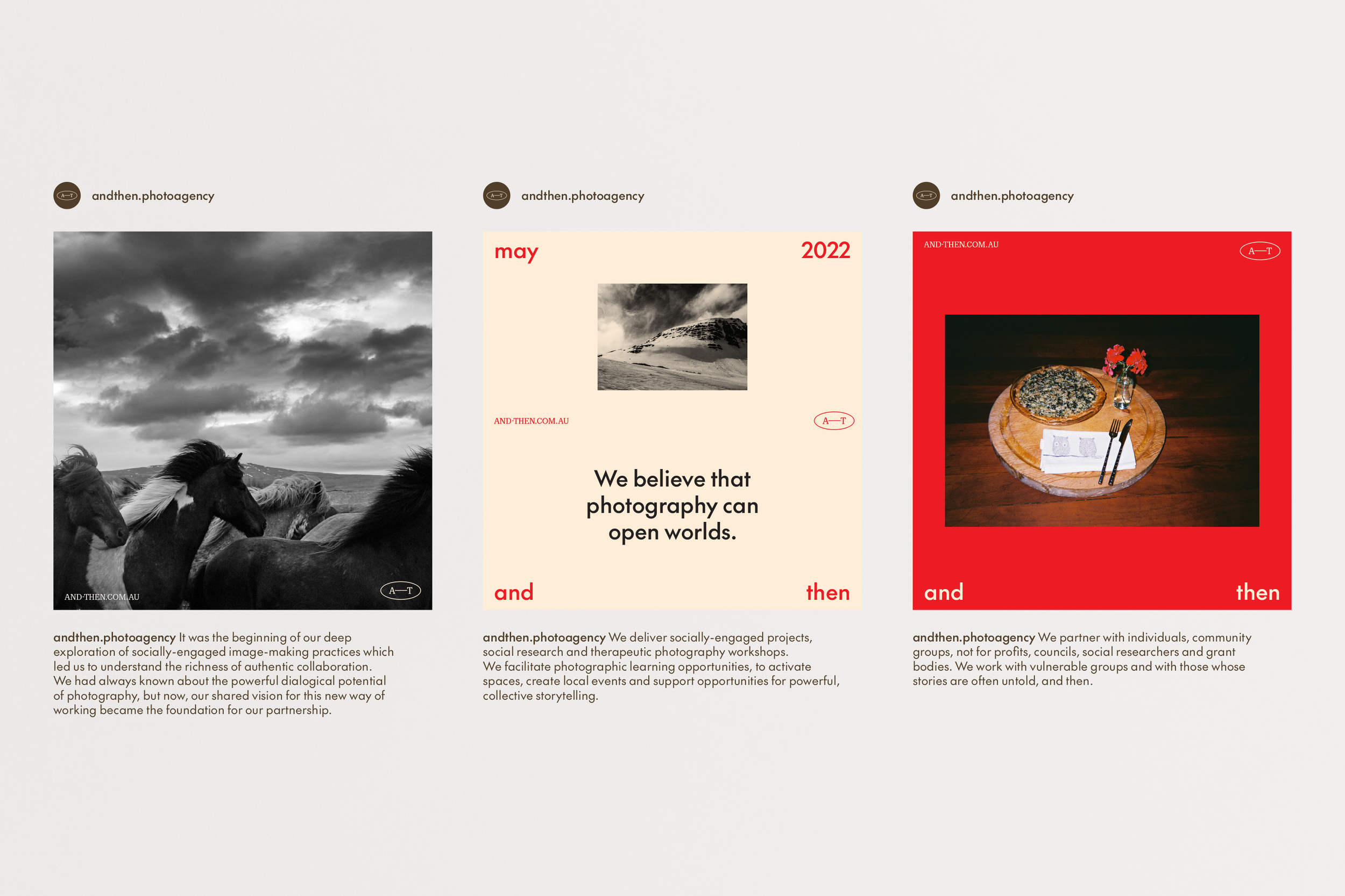
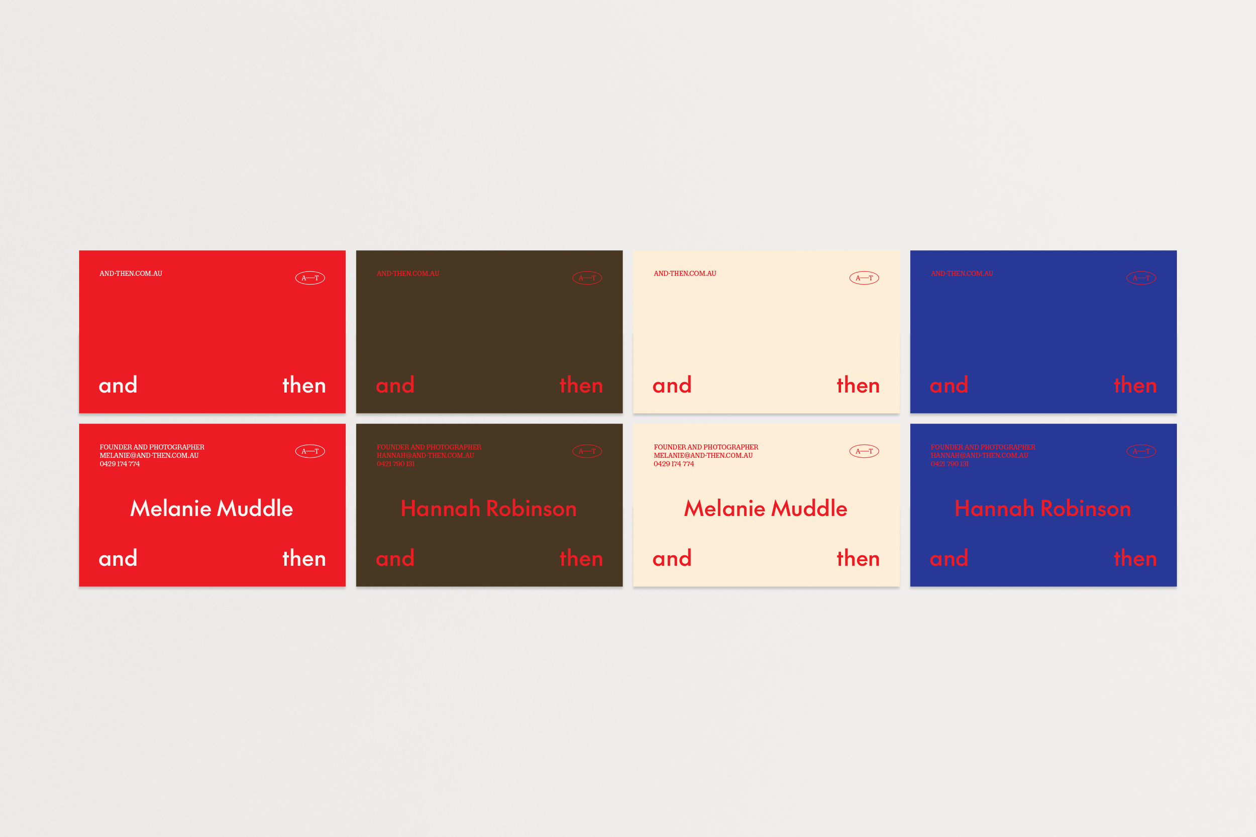
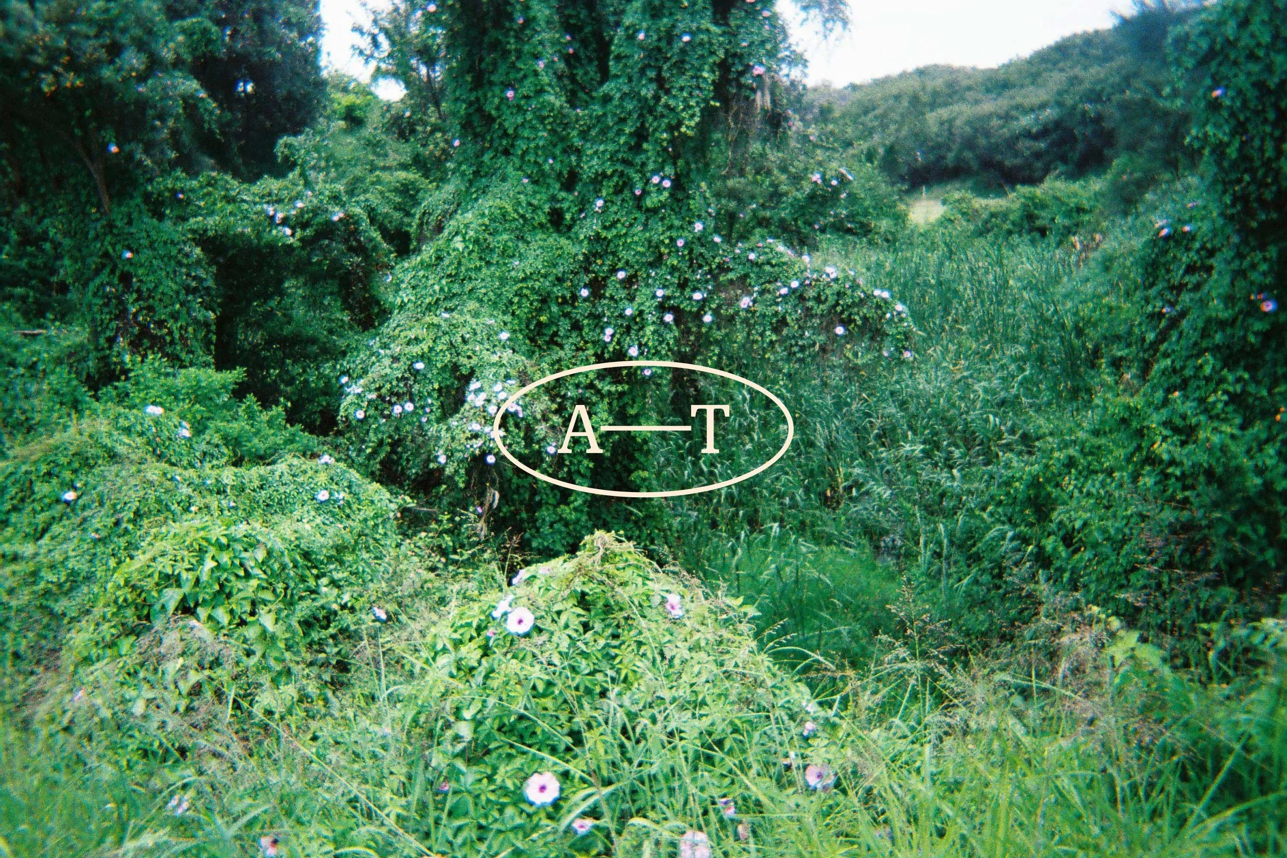
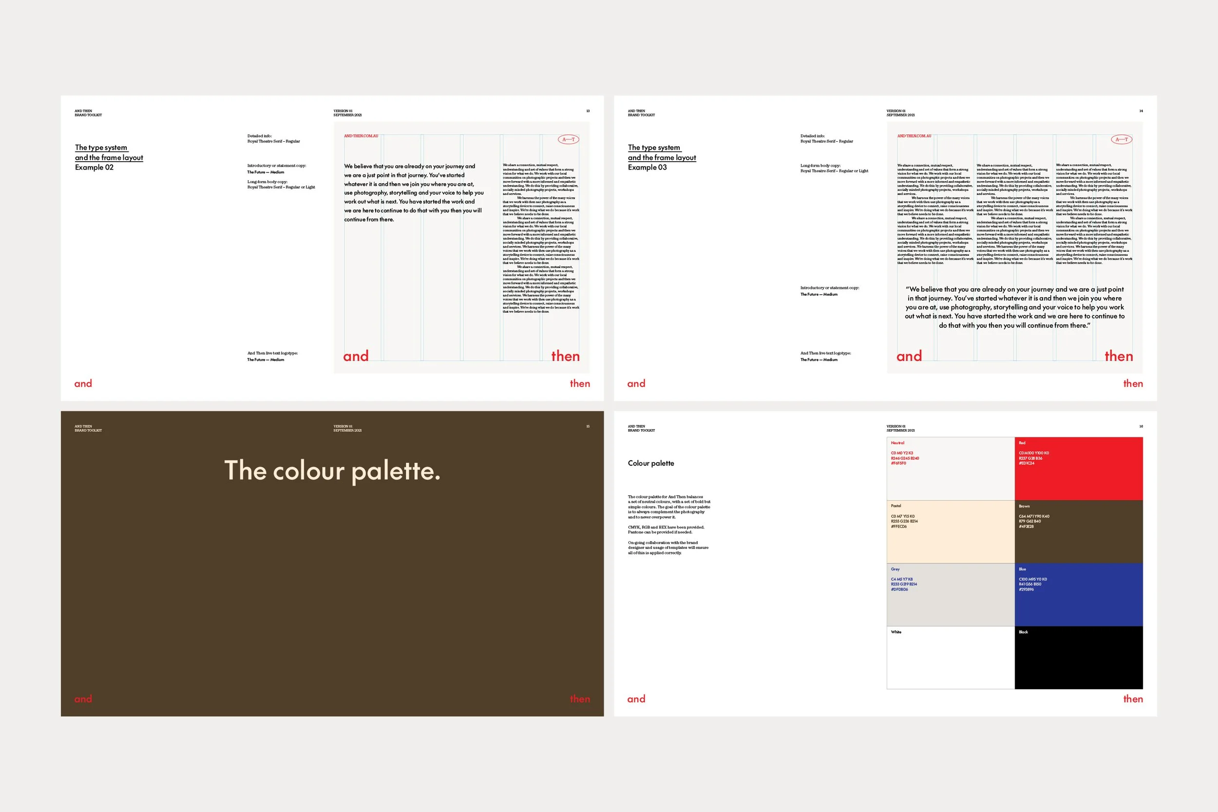
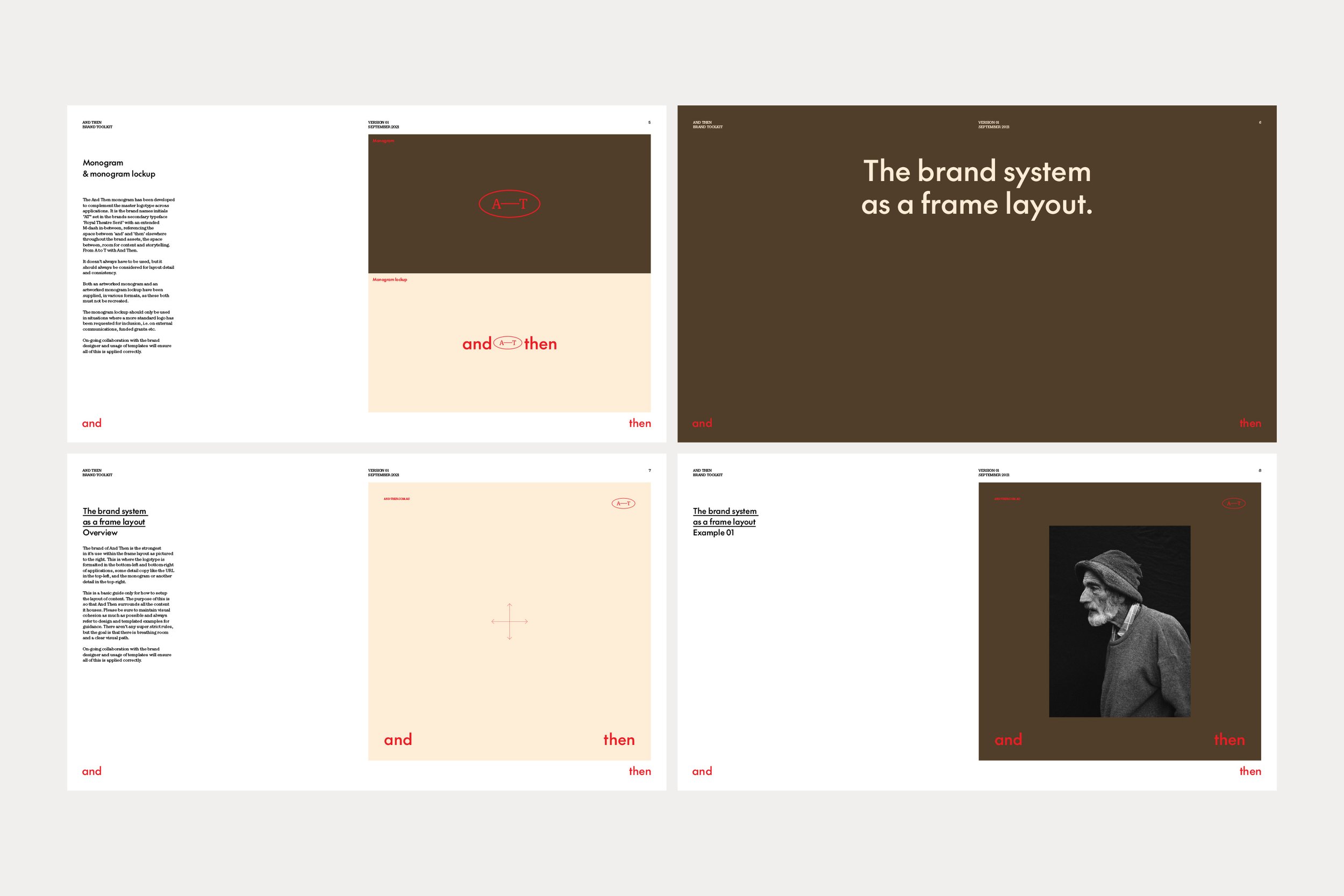
The visual identity pares itself back to basics so that function can be the main priority. Pairing a simple and effective colour palette with additions of bold and earthy tones allows Hannah and Melanie to inject more brand personality when they need it, but stick to basics for the most part.
Using typography throughout with key focus again on functionality and accessibility, a contemporary take on Futura, The Future by Klim Type Foundry, is featured throughout all headers and larger sections of copy. Complementing the bold sans serif is a traditional serif for lower level sections of copy, Royal Theatre Serif by Playtype.
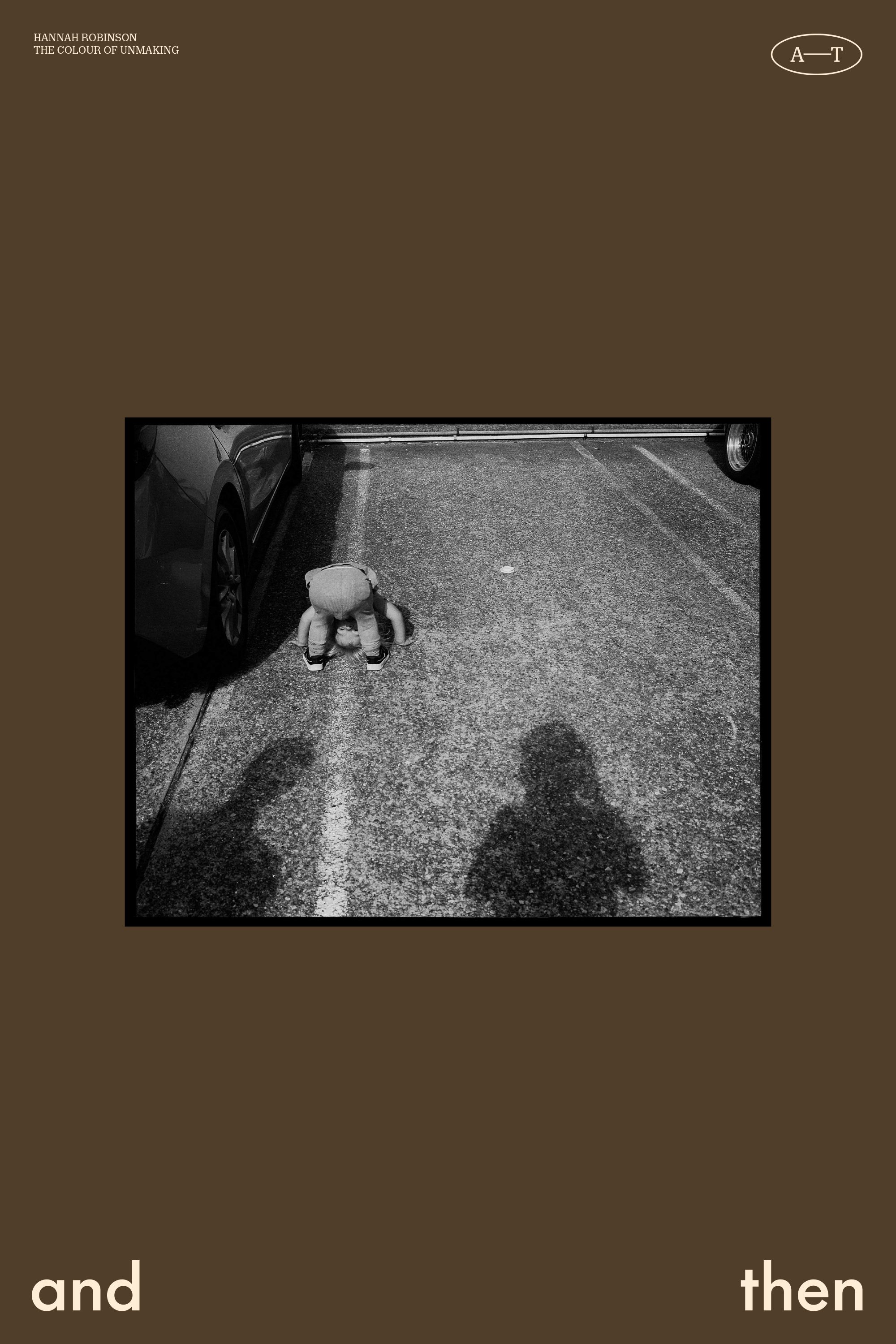
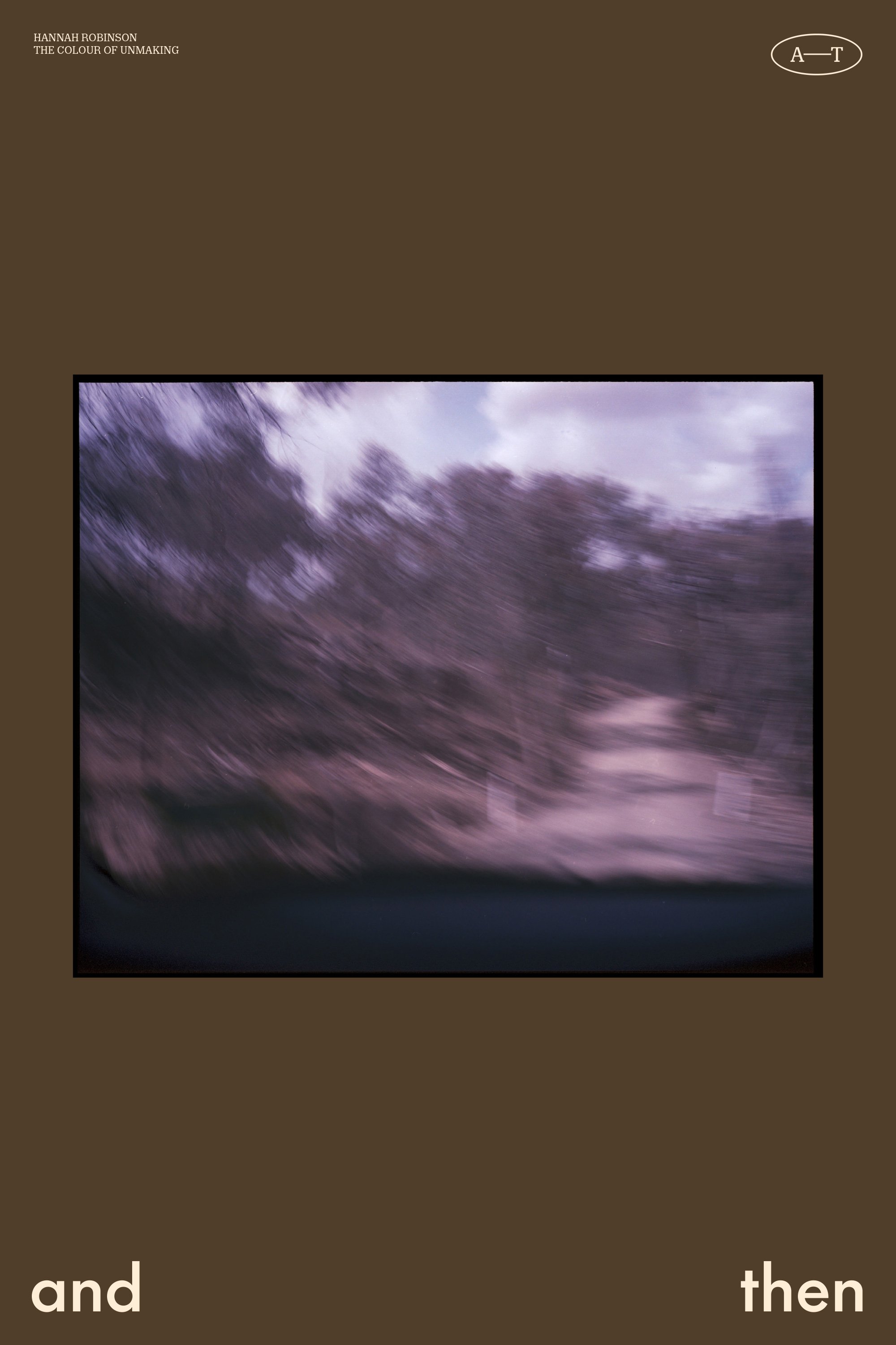
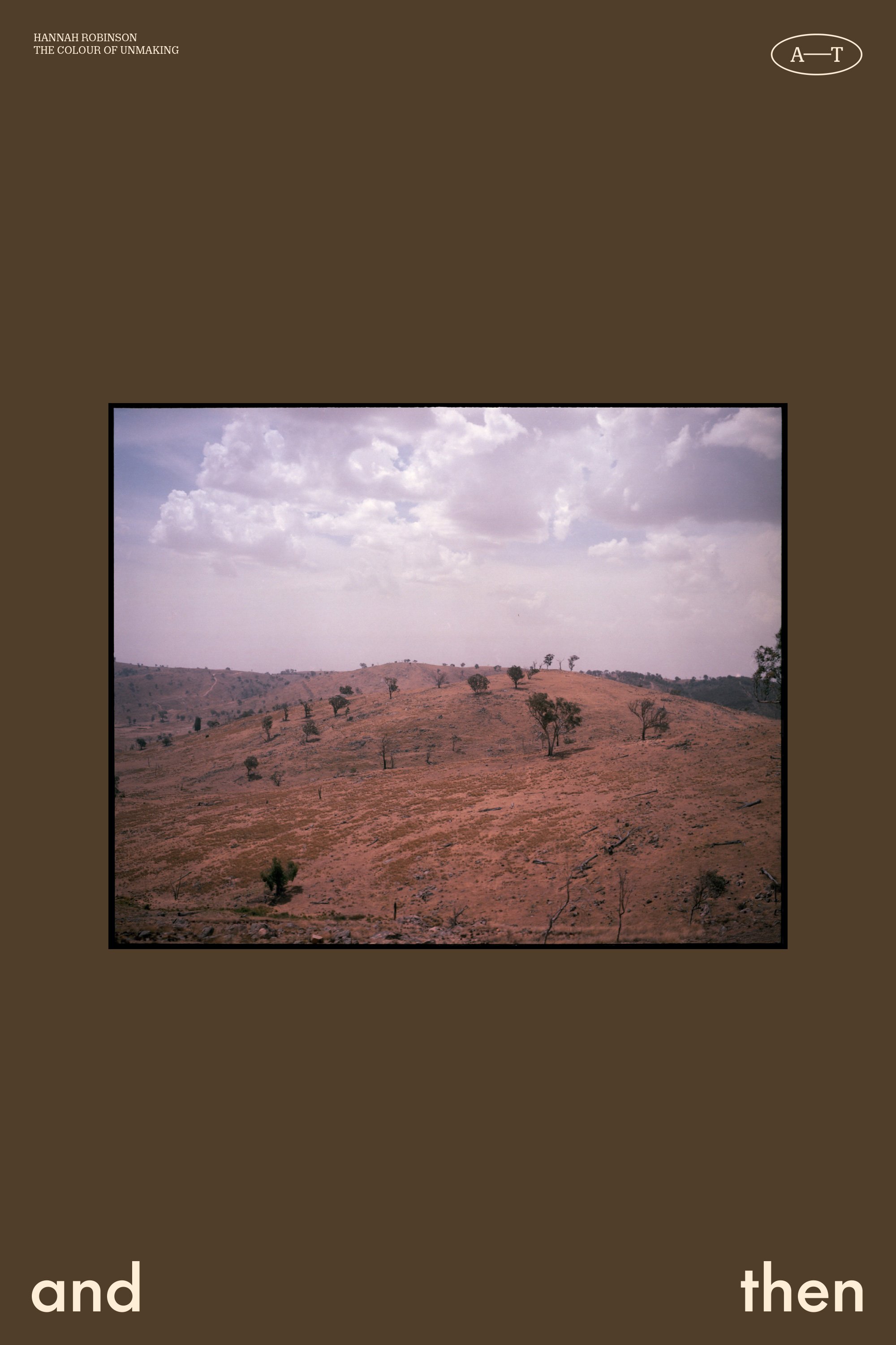
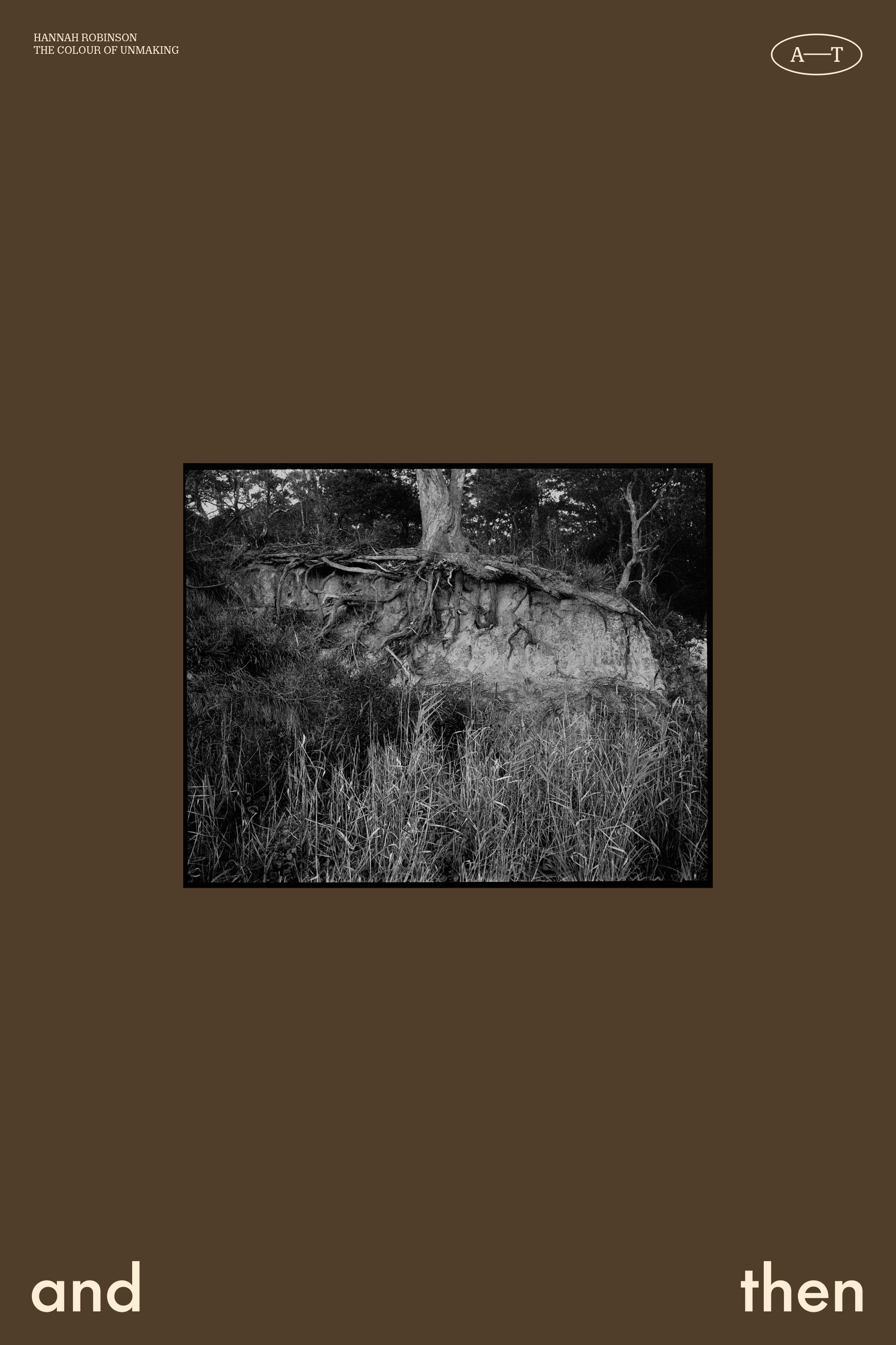
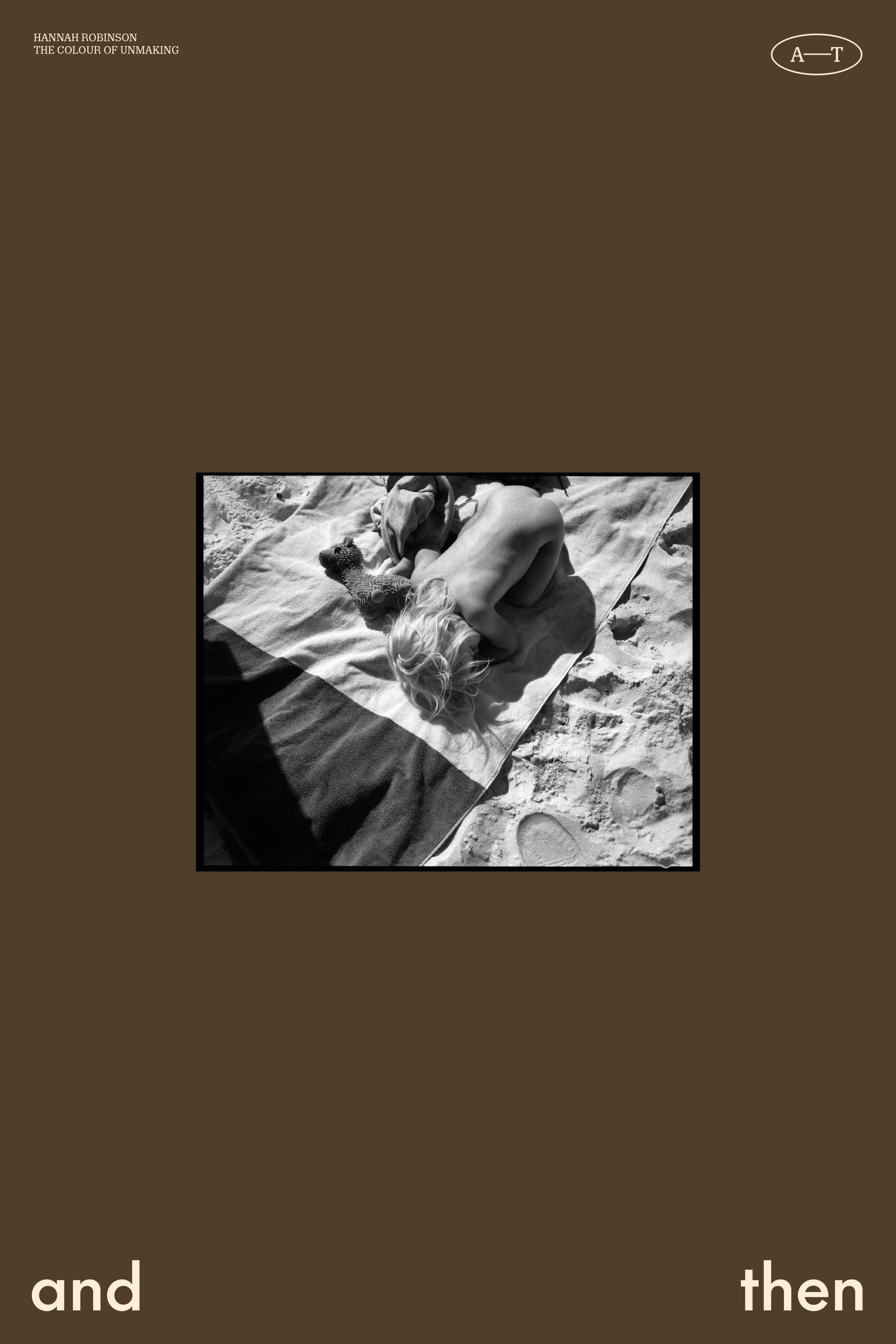
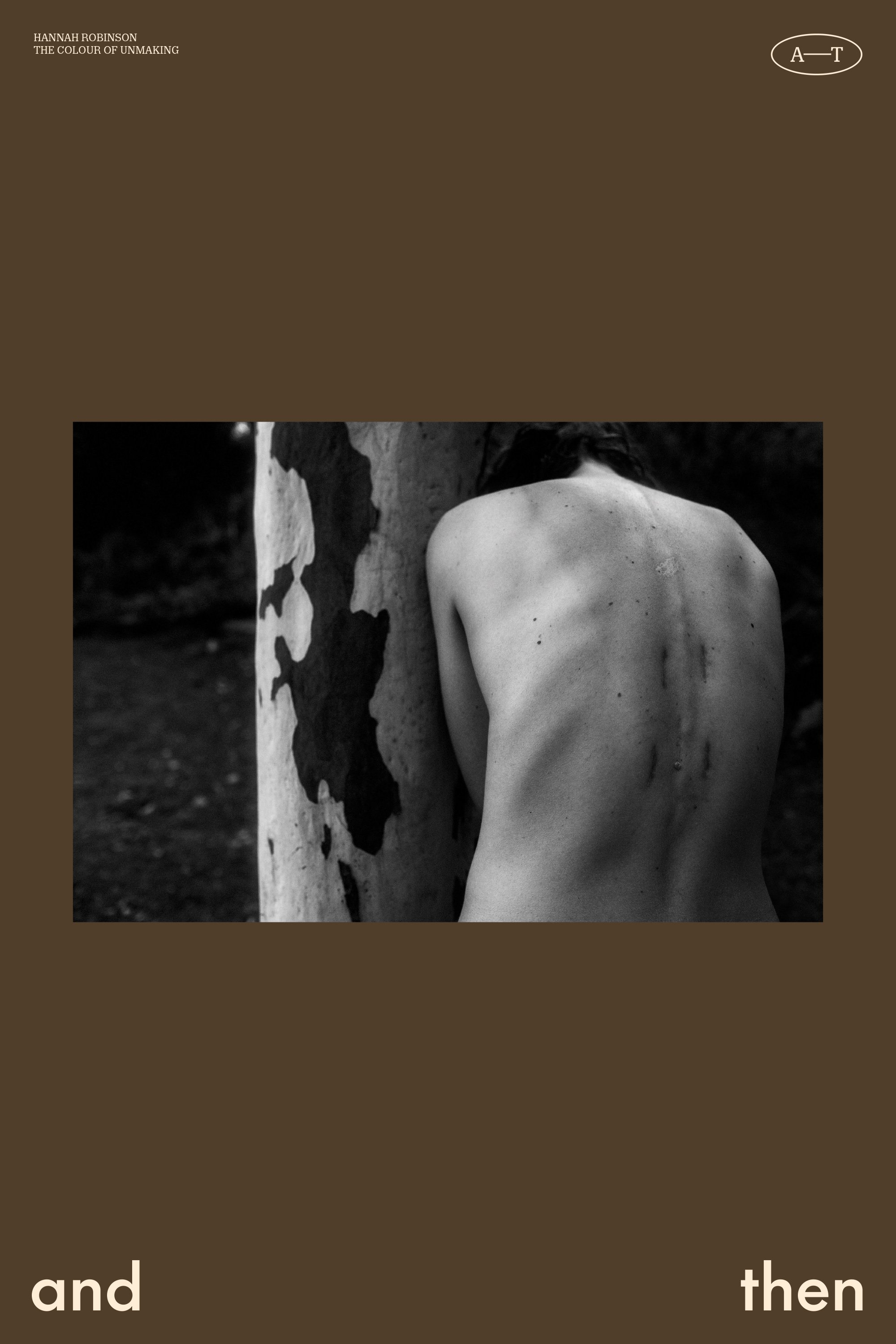
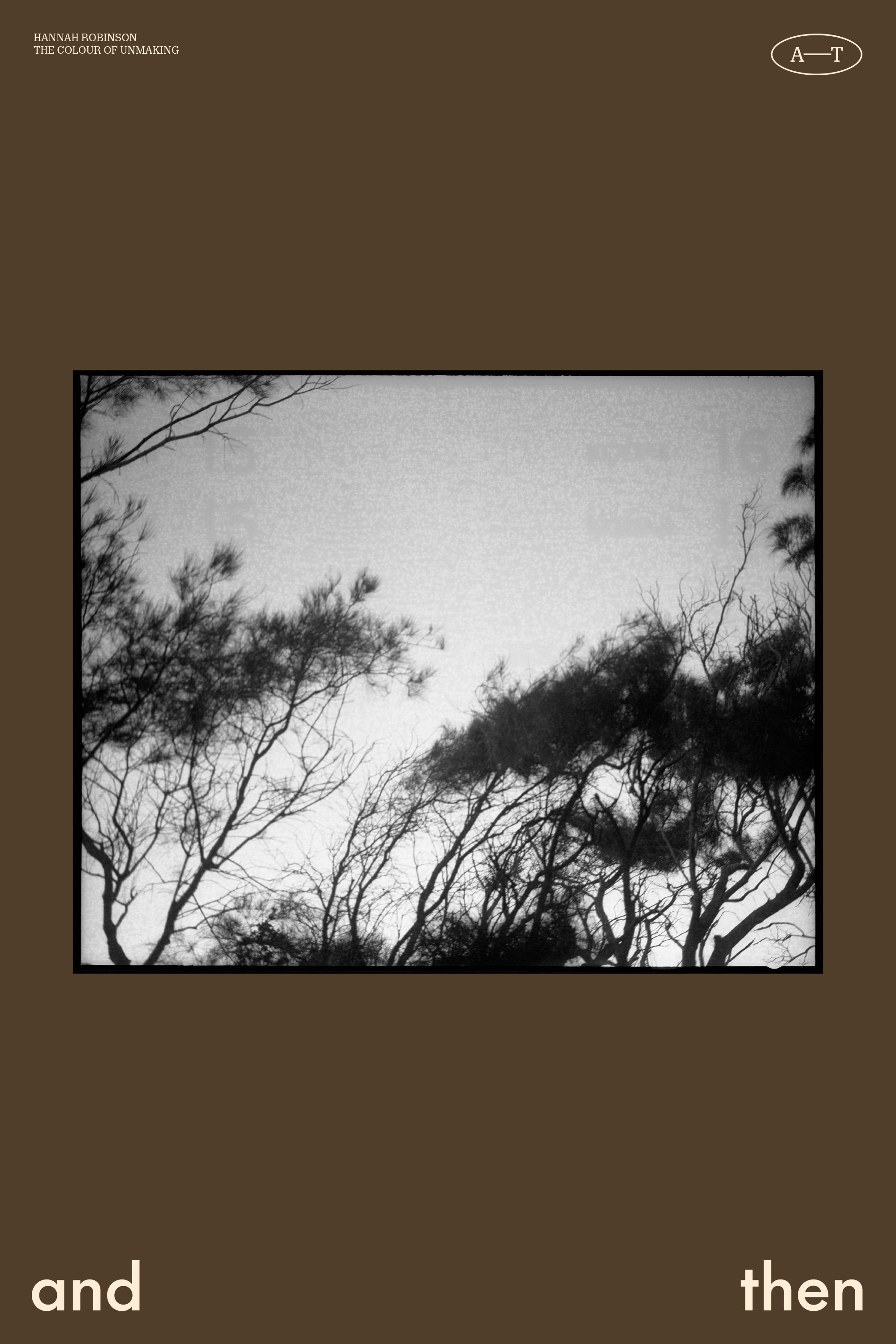
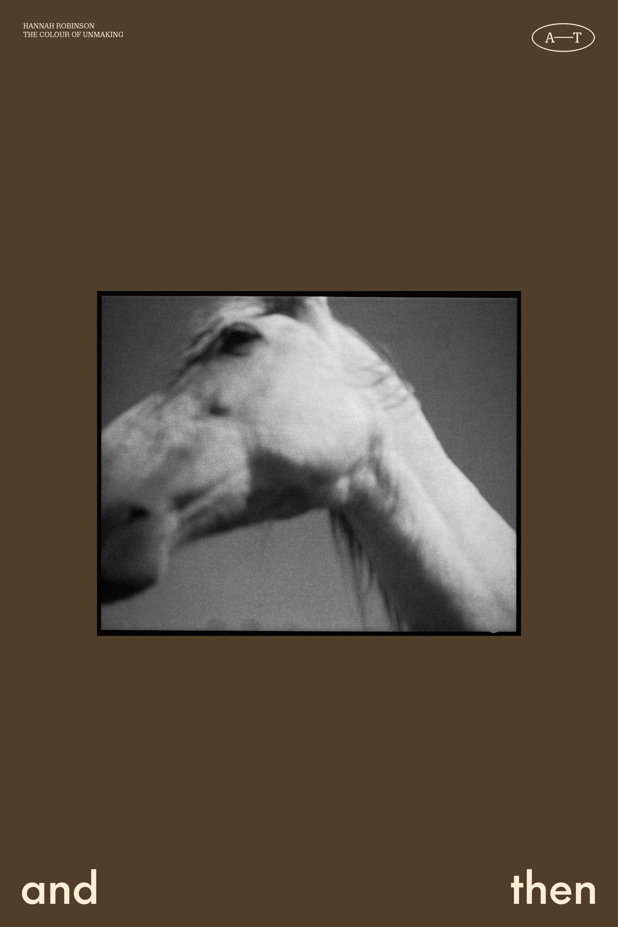
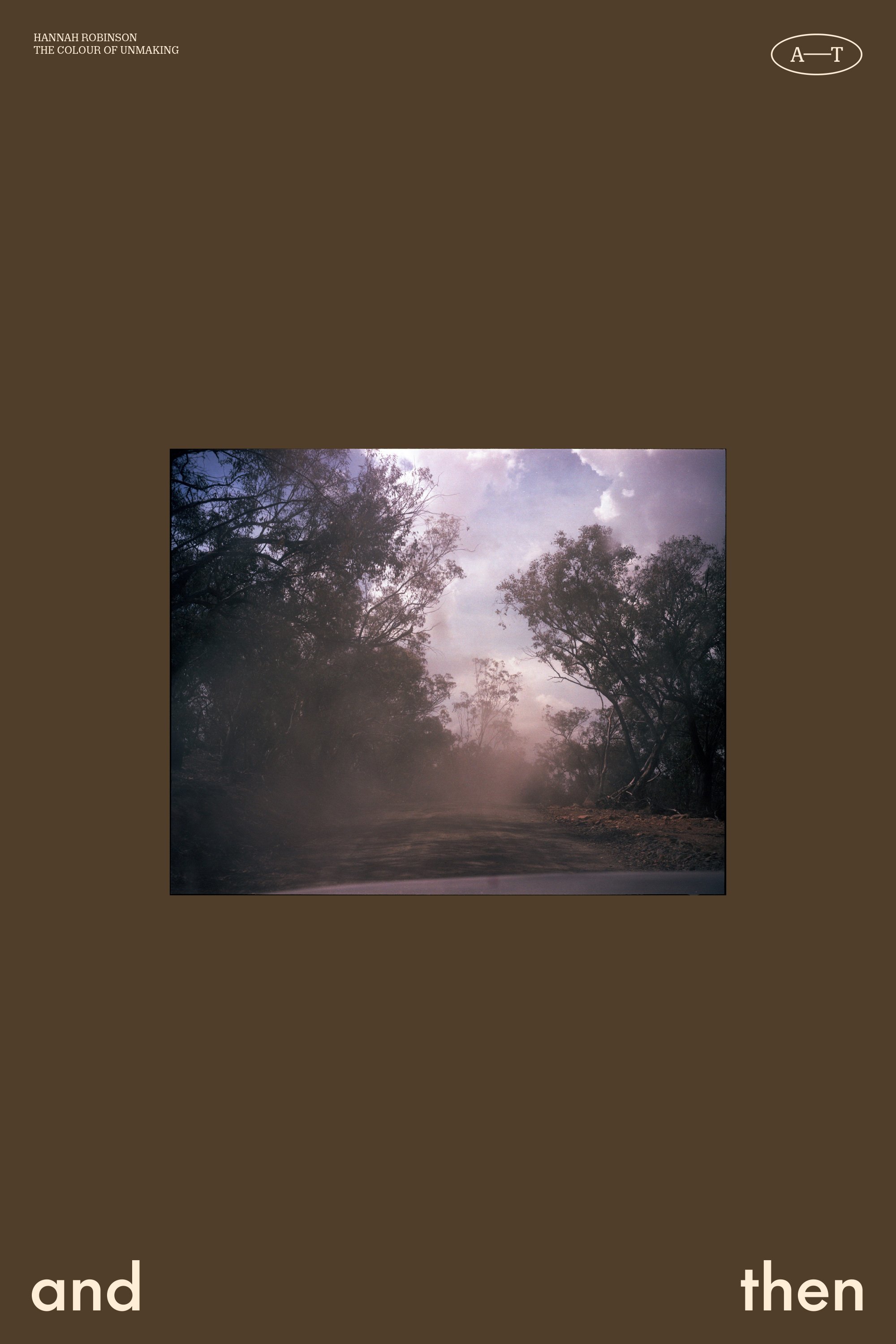
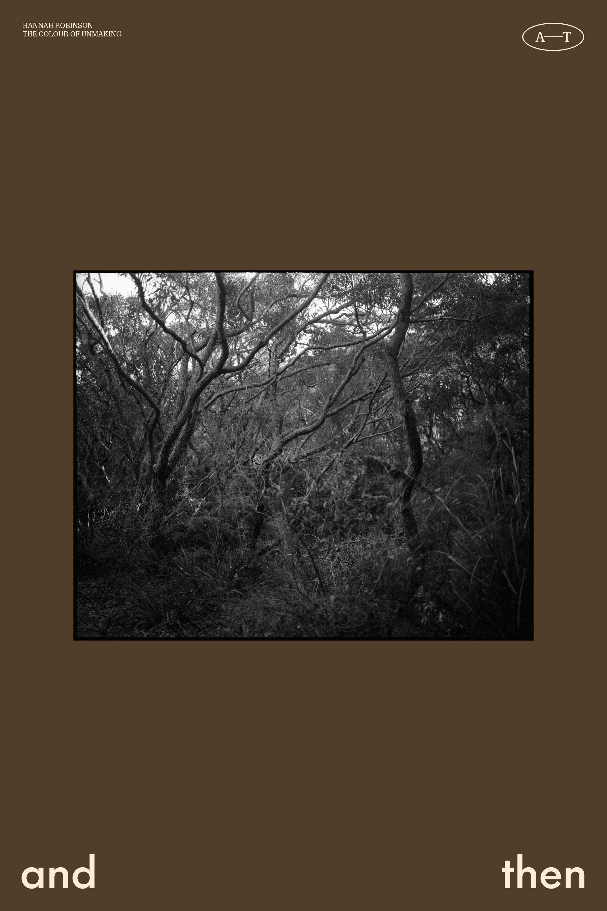
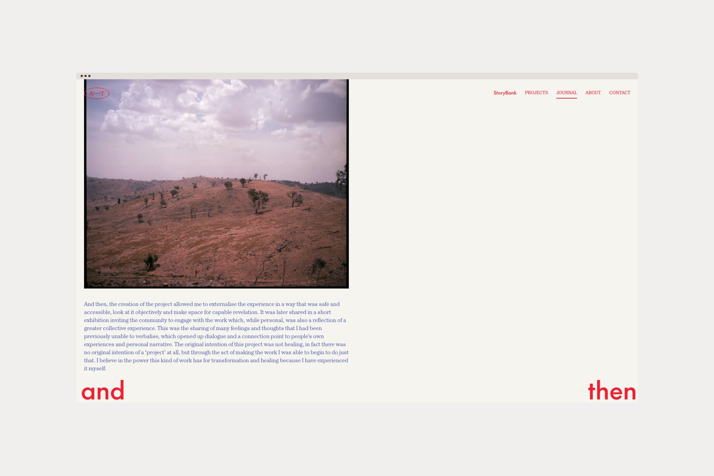
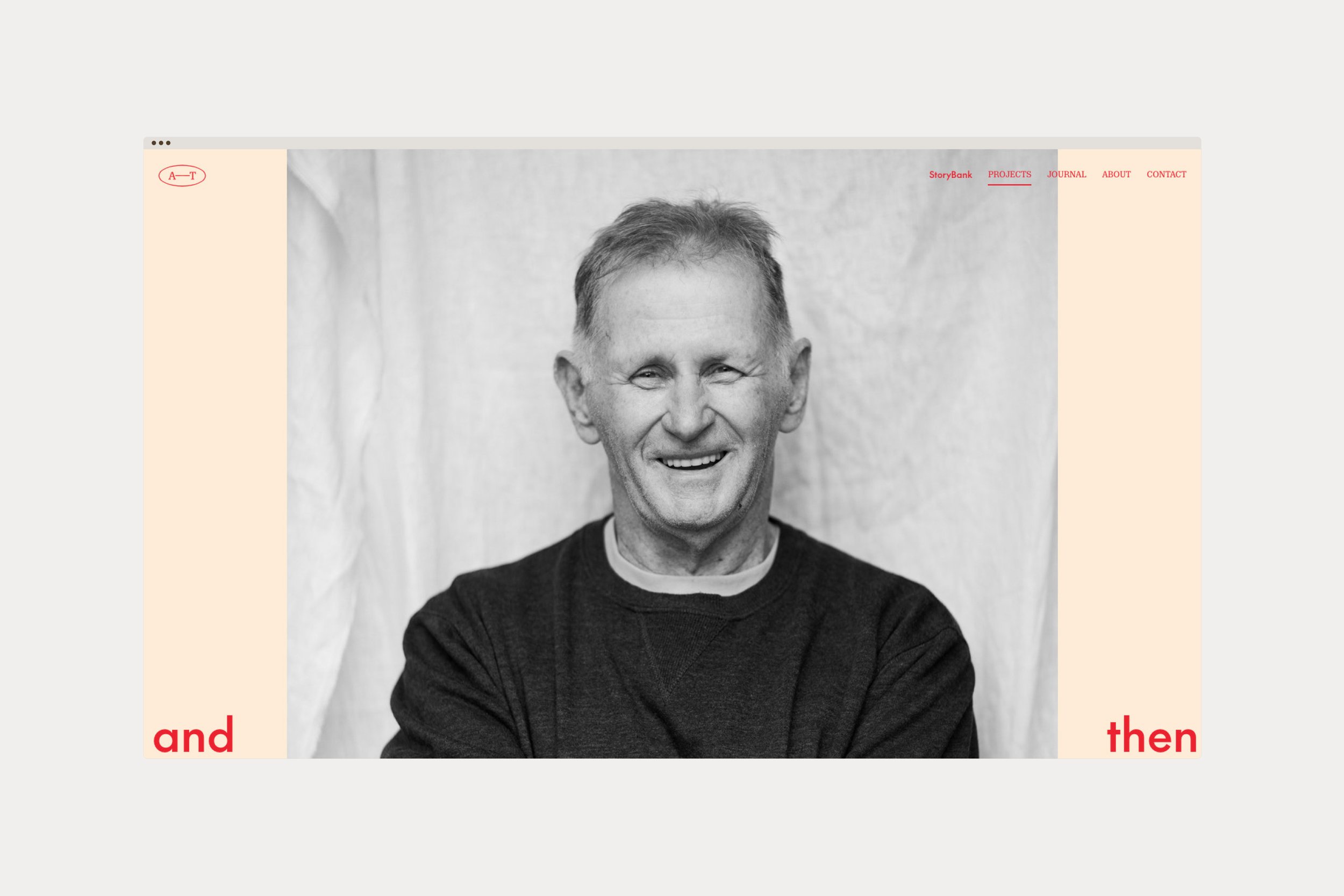
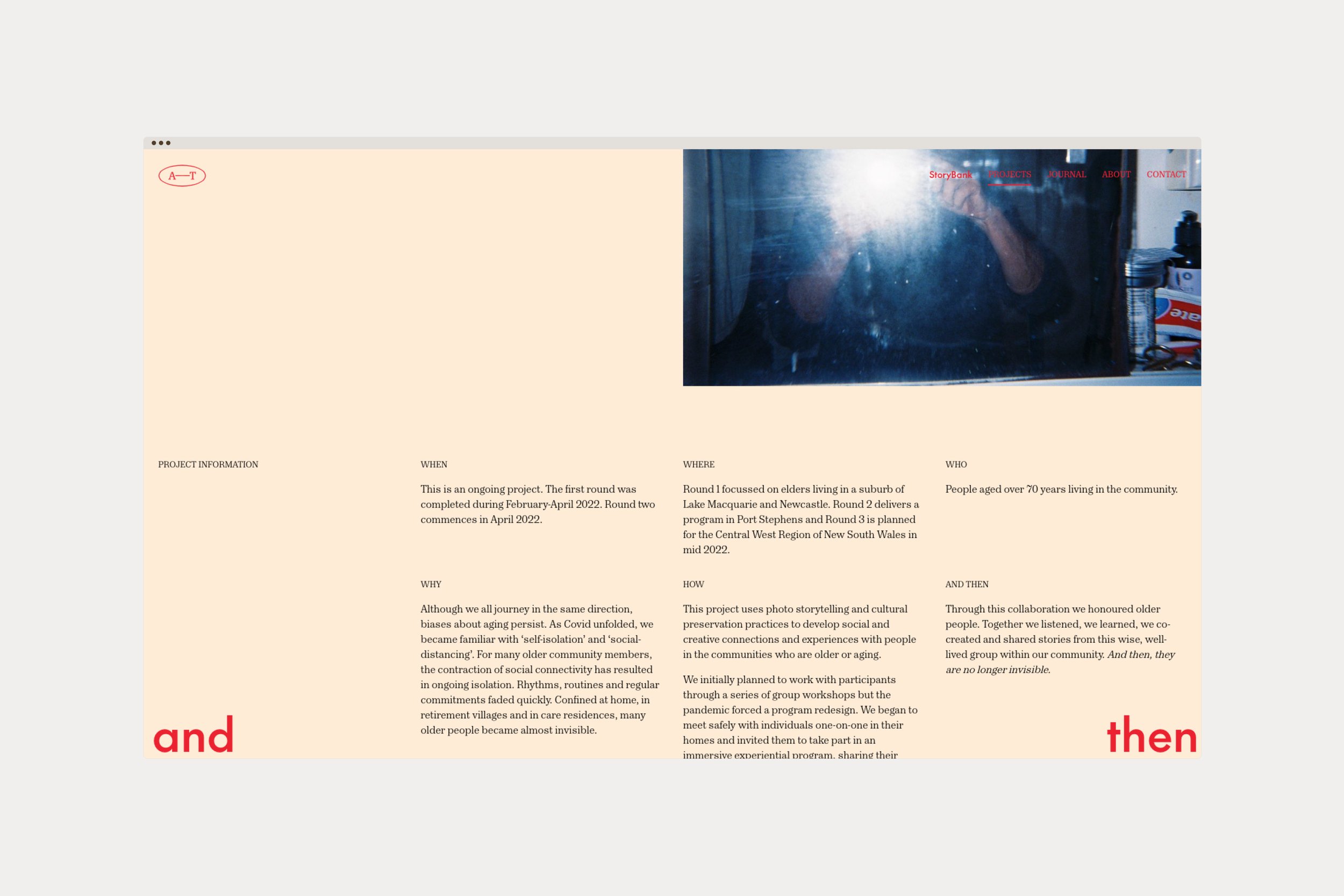
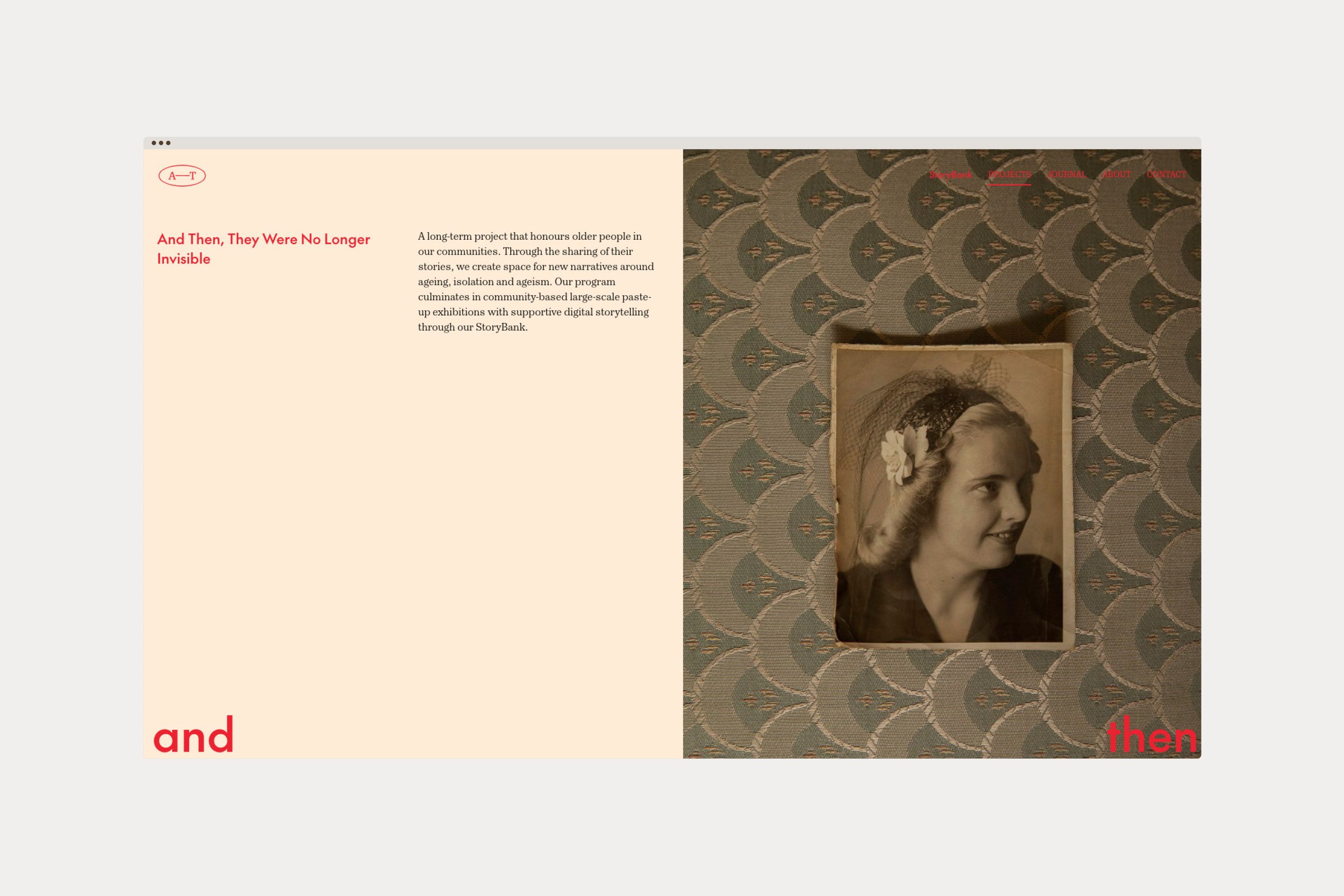
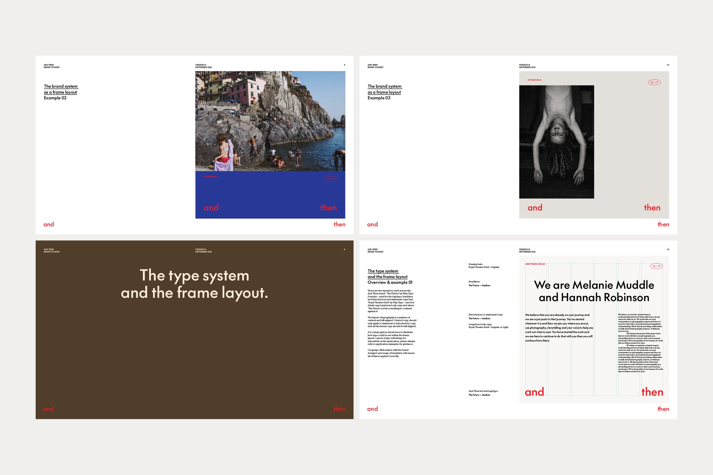
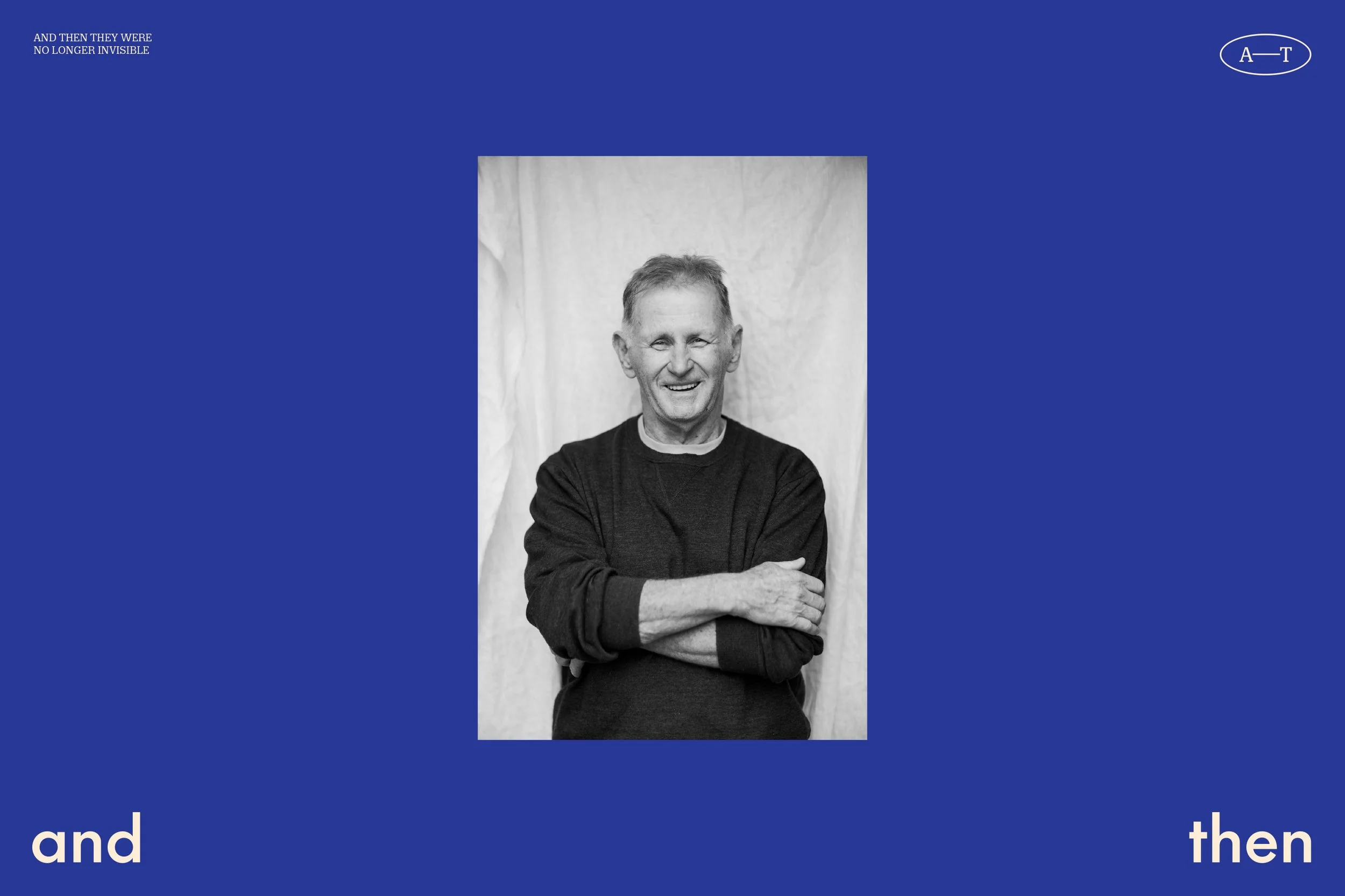
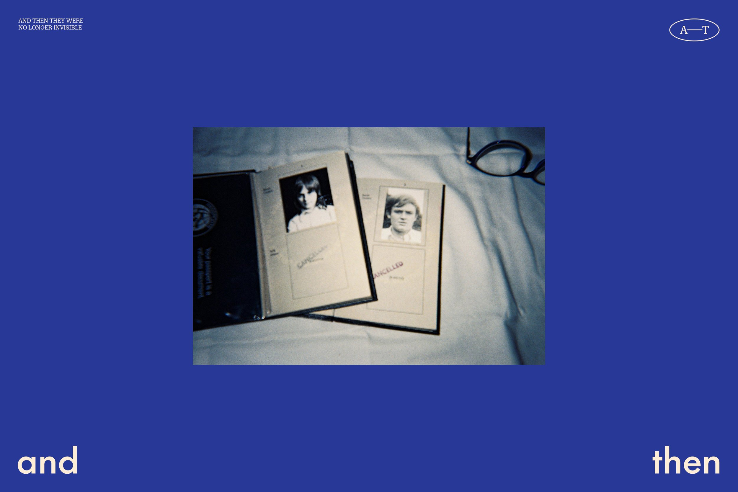
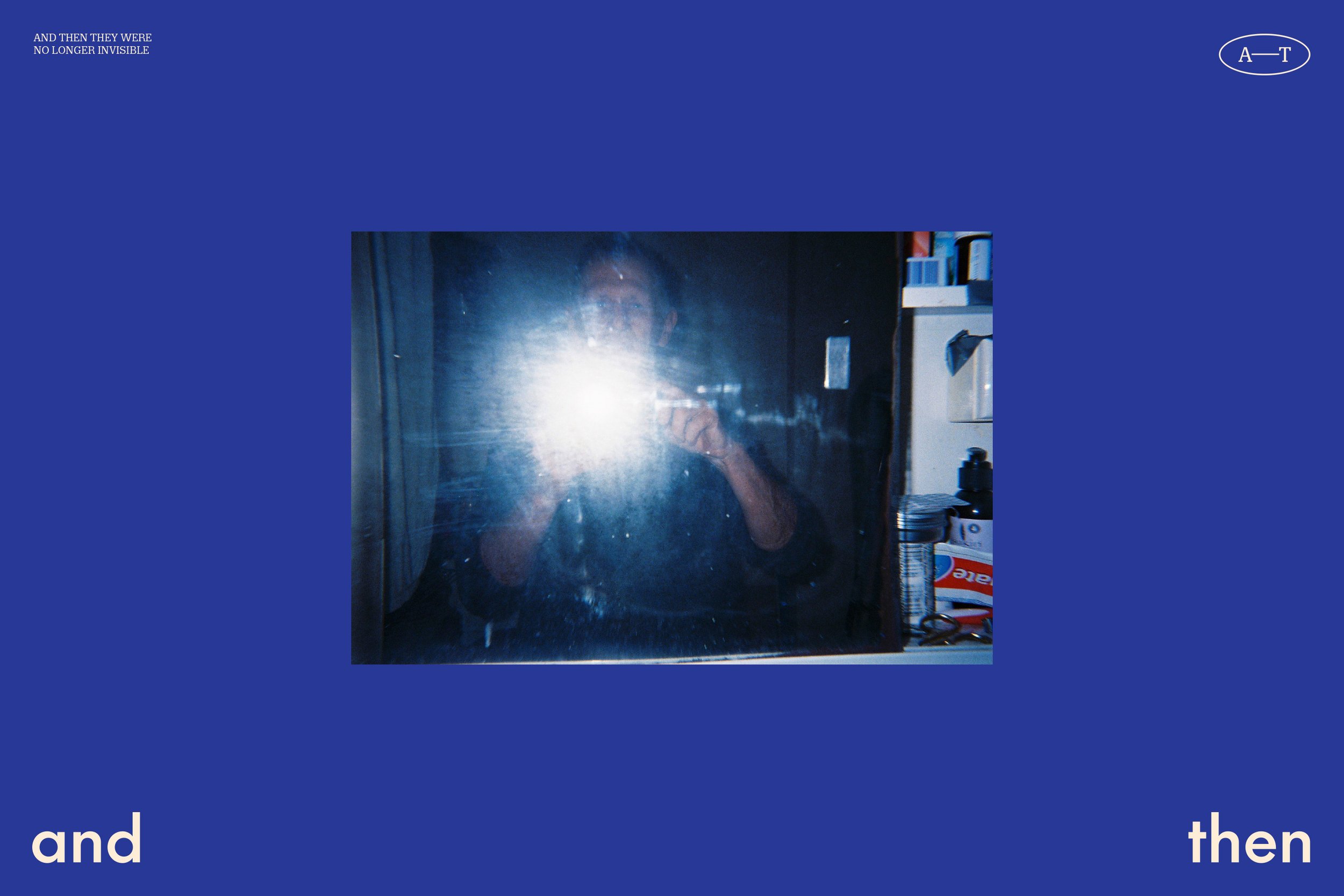
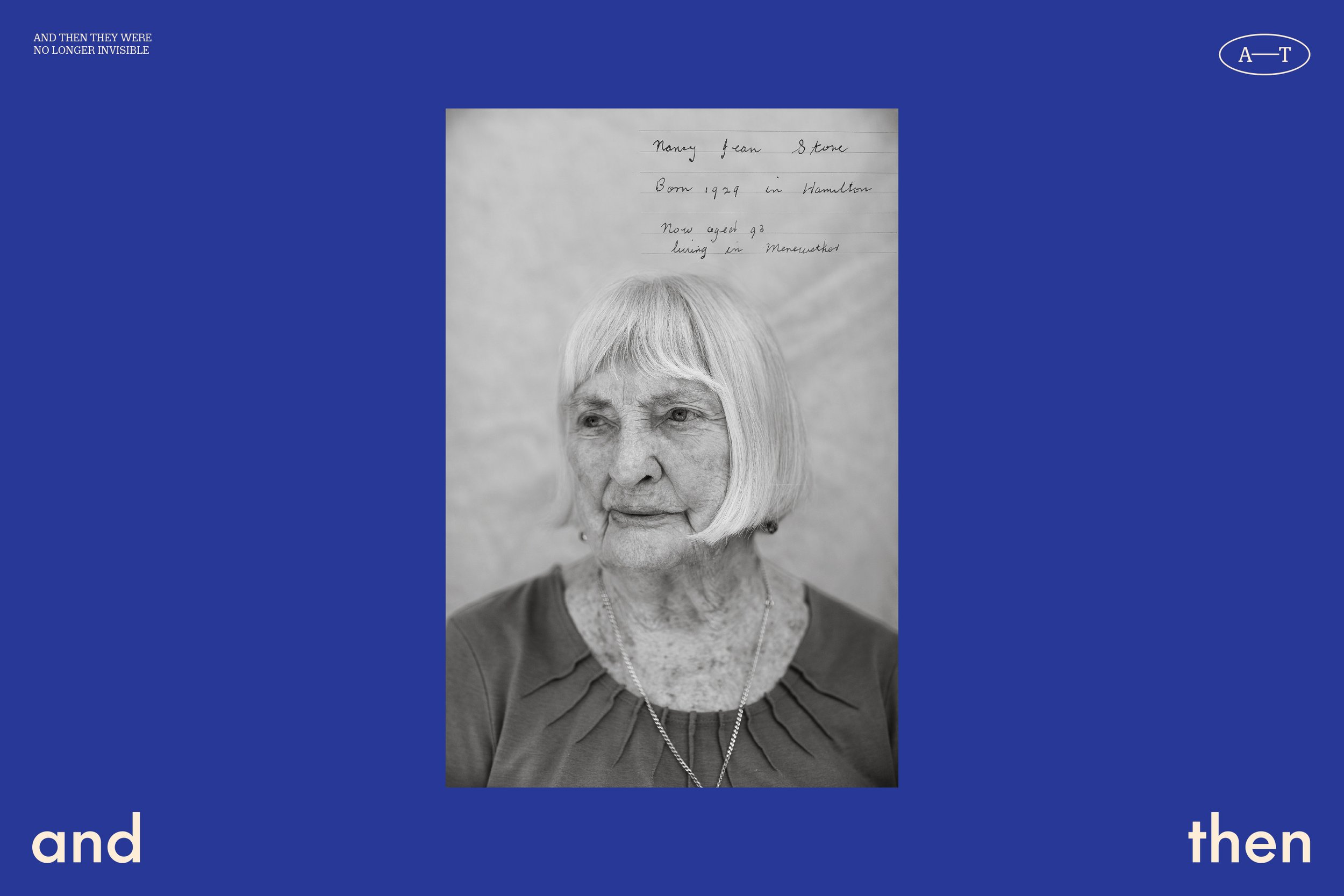
In the material developed as templates for And Then to use in-house, there’s a focus on showcasing their photography alongside clear communication of key information as well. The templates allow these two key components to be dialled up or down. Some pieces feature large imagery and less information, some the opposite with lots of information and less imagery. But all remain functional, legible and on brand.
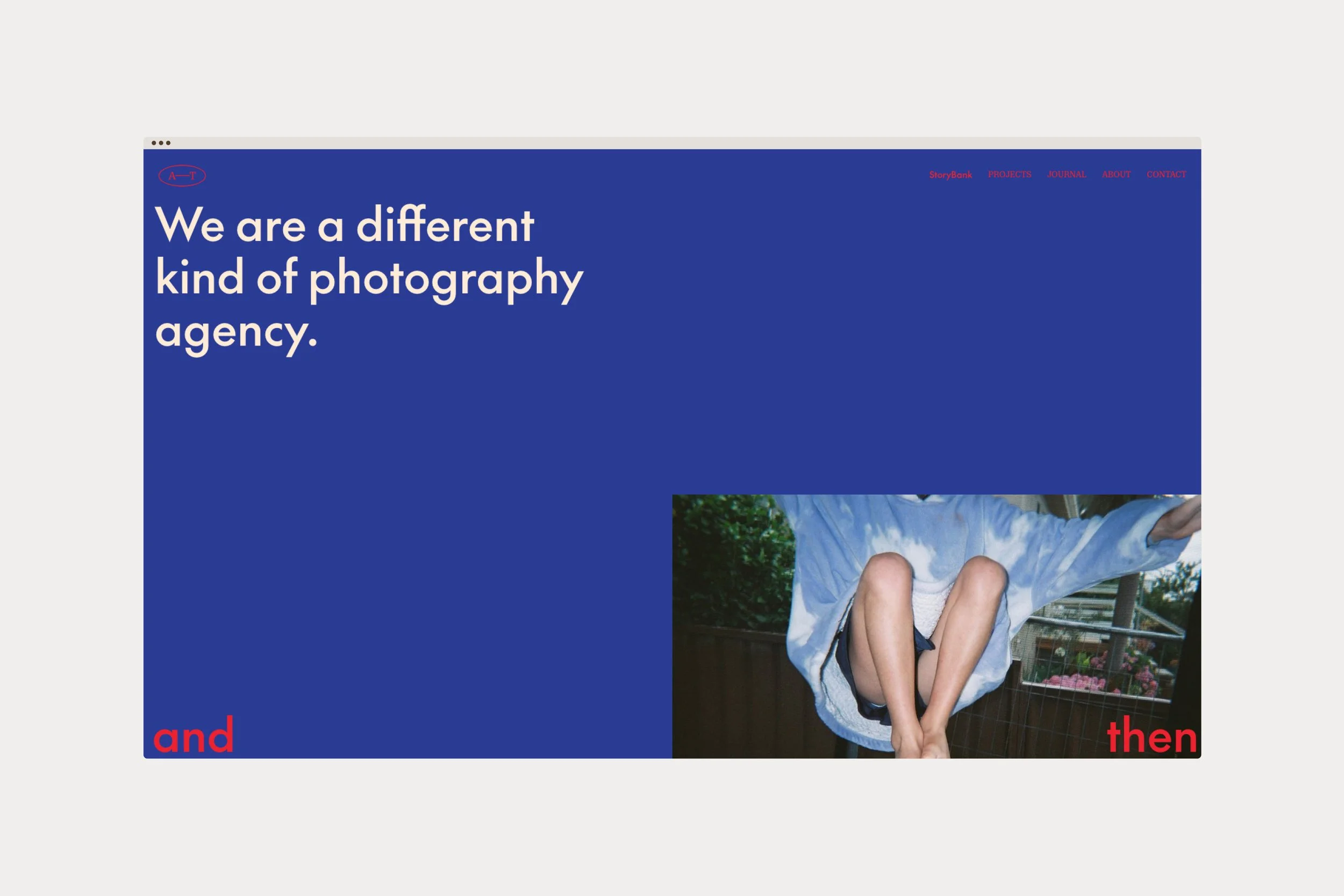
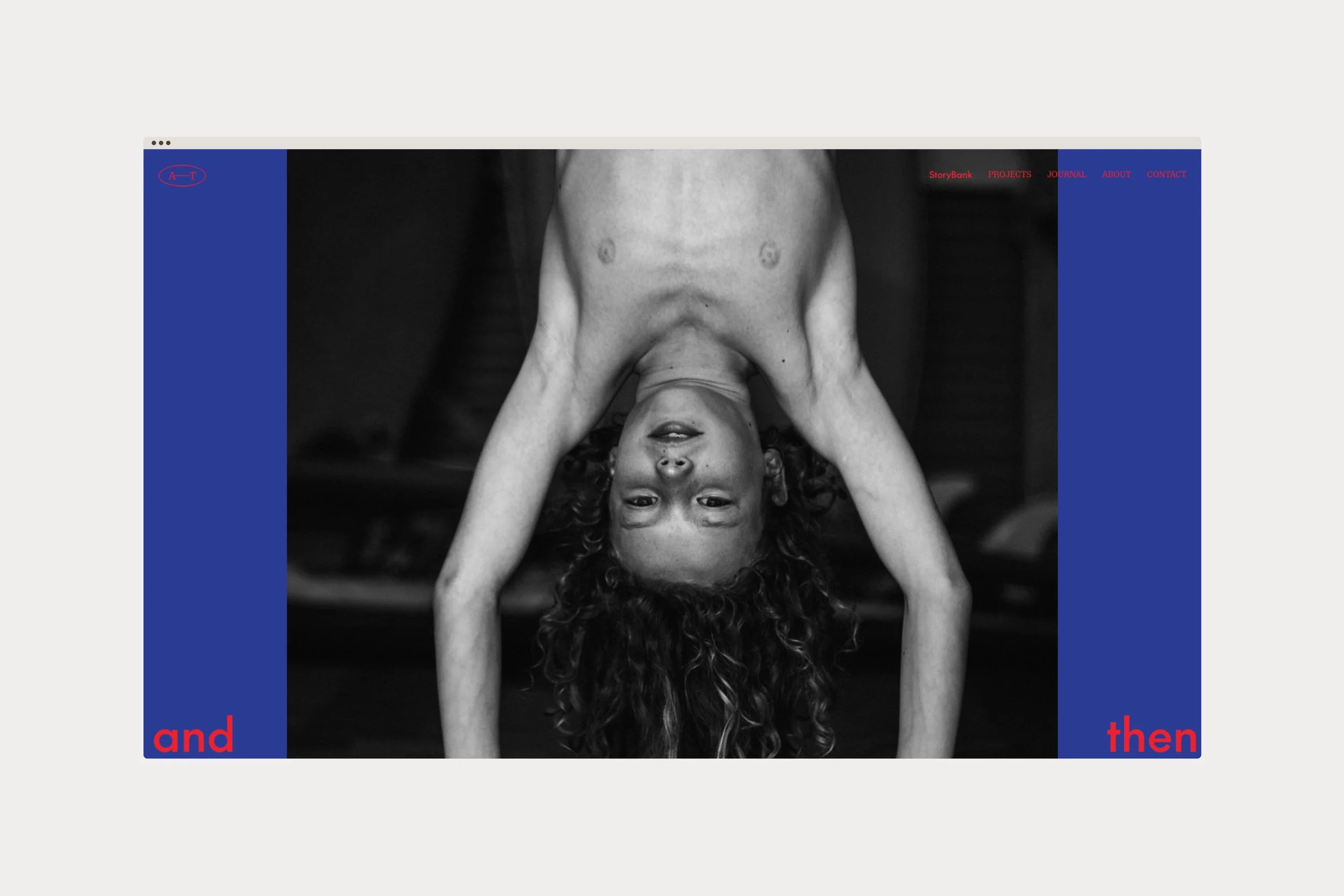
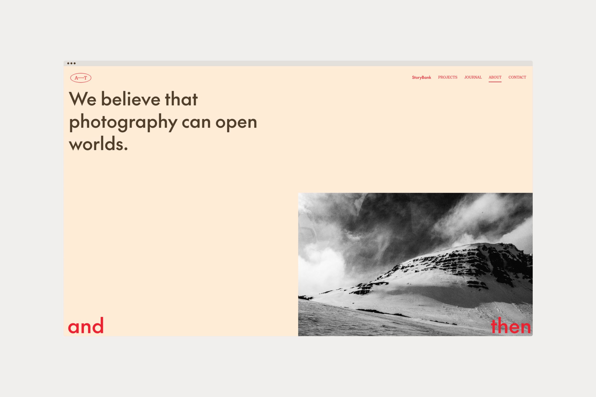
The website designed and developed for And Then serves several purposes. And Then often require Government and Council grants for the work that they do, so the website needed to be a place they could link to to showcase work and documentation. For this, there are functional and simple pages that showcase large sections of information and imagery. They also, at the core of what they do, are artists. So the website needed to allow for a more immersive expression of their work. For this, there are sections that draw viewers in in different ways and allow focus to be directed through content more carefully.
As Hannah and Melanie continue to develop projects, workshops and research, we too are working together to continue developing their website and materials to continuously adapt to whatever may change. As the brand-tone of voice goes, we built a brand and then…

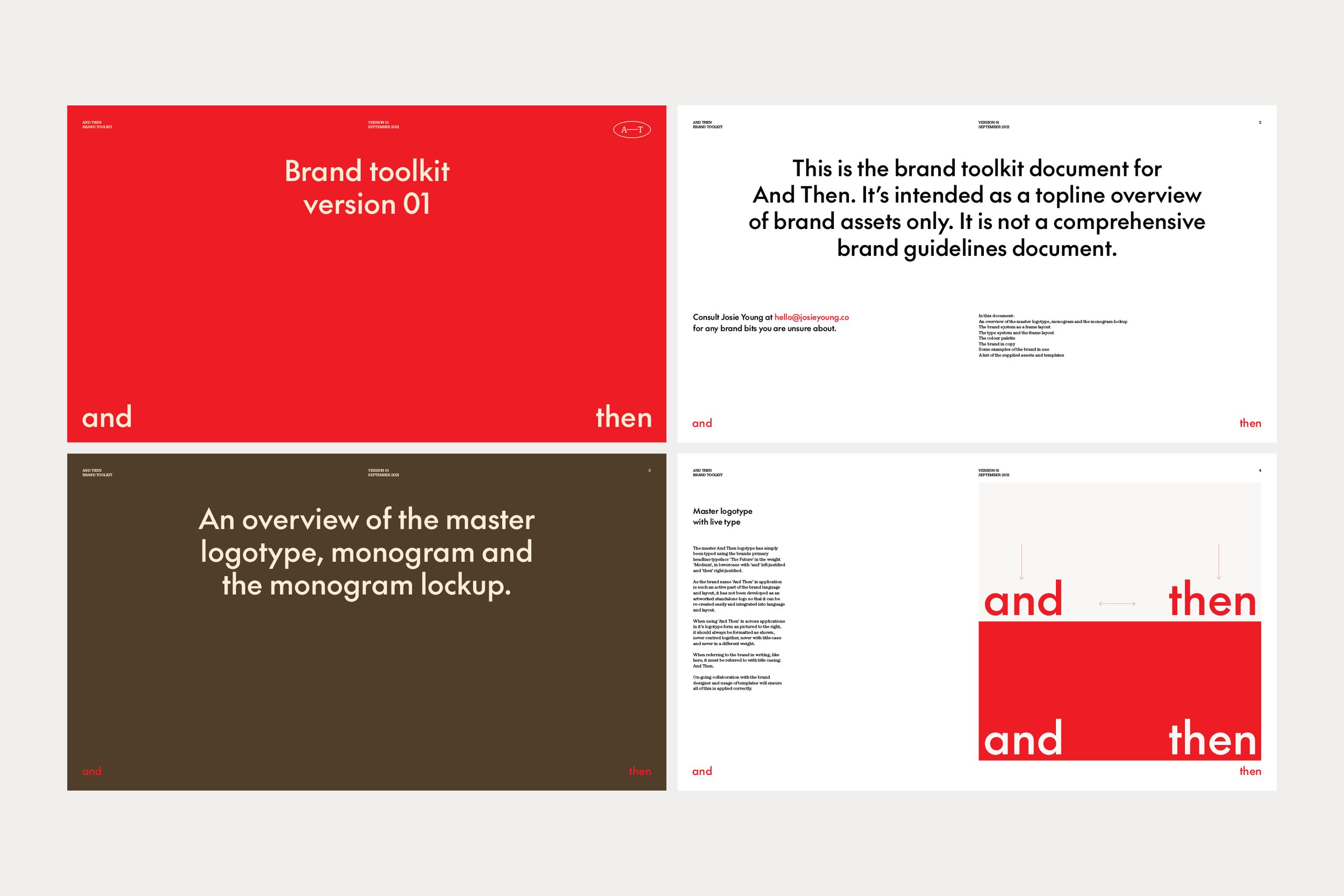
CREDITS
Photography — Hannah Robinson & Melanie Muddle from And Then
Copy editing for And Then — Elisha Kennedy